Media
About
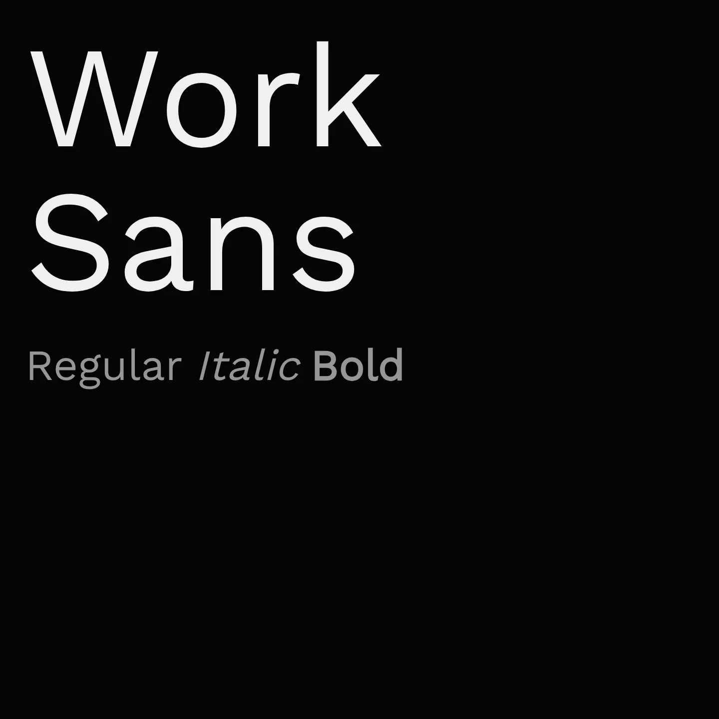
Work Sans is a sans-serif typeface family inspired by early Grotesques, designed primarily for on-screen text at medium sizes but also suitable for print. It features simplified forms and larger diacritics for better screen readability. The family spans a wide weight range and includes a variable font version for flexible use. Its design balances functionality and clarity across digital and print environments.
Overview
Work Sans is a typeface family based loosely on early Grotesques, such as those by Stephenson Blake, Miller & Richard, and Bauerschen Giesserei. The Regular weight and others in the middle of the family are optimized for on-screen text usage at medium sizes (14px-48px) and can also be used in print design. The fonts closer to the extreme weights are designed more for display use both on the web and in print. Overall, features are simplified and optimized for screen resolutions; for example, diacritic marks are larger than how they would be in print. A version optimized for desktop applications is available from the Work Sans GitHub project page. The Work Sans project is led by Wei Huang, a type designer from Australia. This avoids the complication of a second "Hairline" family. The ExtraLight (200) and Light (300) styles also changed accordingly. Reflow will occur from previous versions on these weights. Updated February 2020: Family has been upgraded to a variable font family.
Designer: Wei Huang
Complementary fonts:
- Use Work Sans for display with JetBrains Mono or Bitter for supporting text.
- Use Libre Baskerville for headlines with Work Sans for body text.
Similar fonts:
- Khula
- Assistant
Usage
"" Access one-stop/work-sans using the OneStop MCP.If you do not have the OneStop MCP, read the MCP setup docs.