Media
About
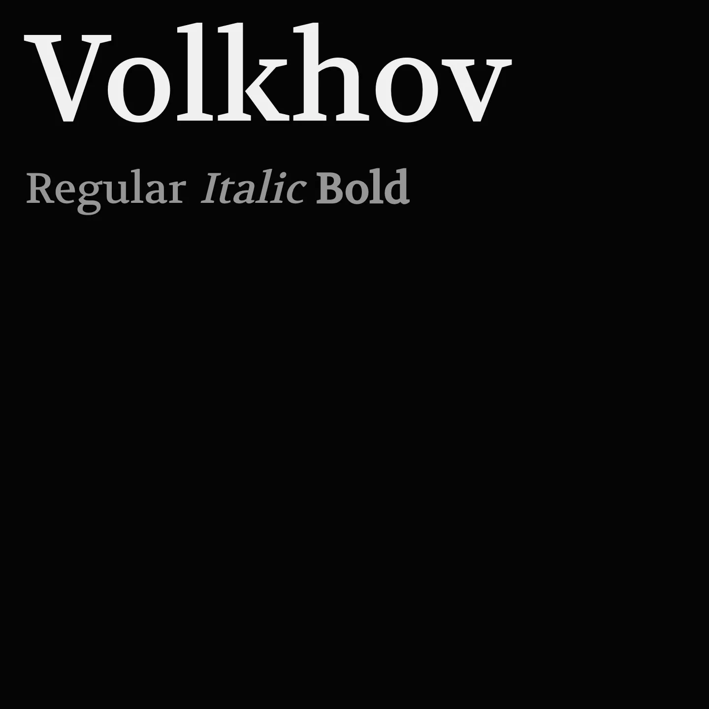
Volkhov features large open counters, short descenders, and asymmetric serifs, balancing contemporary prominence with economical design. Available in regular and bold weights with italic styles, it supports clear, comfortable reading with a distinctive calligraphic italic counterpart to its rigorous regular form. Its spacing adapts slightly in bold to maintain clarity.
Overview
Volkhov is a low-contrast seriffed typeface with a robust character, intended for providing a motivating reading experience. As a four-weight family it is well-suited for complex text environments being economic and legible, contemporary and prominent. Many of its design solutions relate to this purpose: large open counters, rather short descenders, and brutal asymmetric serifs. Spacing in Bold is slightly increased compared to the normal weight, because the bold mass is mostly grown inwards. The Italic has a steep angle and a distinctive calligraphically reminiscent character, as a counterpart to the rigorous Regular.
Designer: Ivan Petrov
Similar fonts:
- PT Serif
- Merriweather
Usage
"" Access one-stop/volkhov using the OneStop MCP.If you do not have the OneStop MCP, read the MCP setup docs.