Media
About
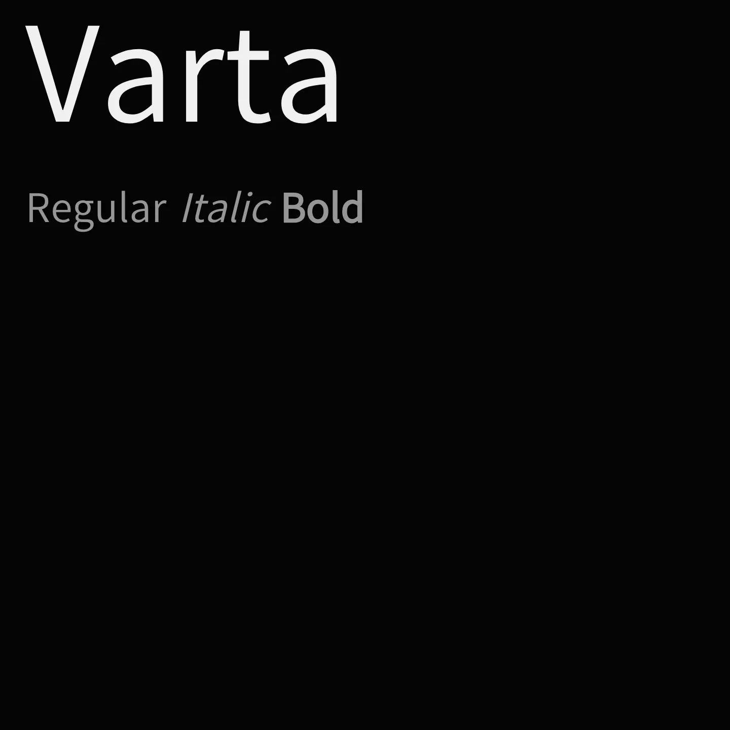
Varta combines a congenial personality with professional crispness, optimized for legibility at small sizes and adaptable to both low and high-quality screens. Its design suits diverse applications including signage, editorial layouts, packaging, and extended screen reading, offering a broad range of utility through its variable weight axis.
Overview
Varta is a sans serif family that fuses warm humanity with bright clarity and professional crispness whose congenial personality emerges at larger sizes. It is a variable font designed to render well down to surprisingly small sizes and on both low and high-quality screens, providing broad utility. Its features make it well suited to a variety of tasks, including sign systems, editorial design, packaging, and extended reading on screens.
Designers: Joana Correia, Viktoriya Grabowska, Eben Sorkin
Usage
"" Access one-stop/varta using the OneStop MCP.If you do not have the OneStop MCP, read the MCP setup docs.