Media
About
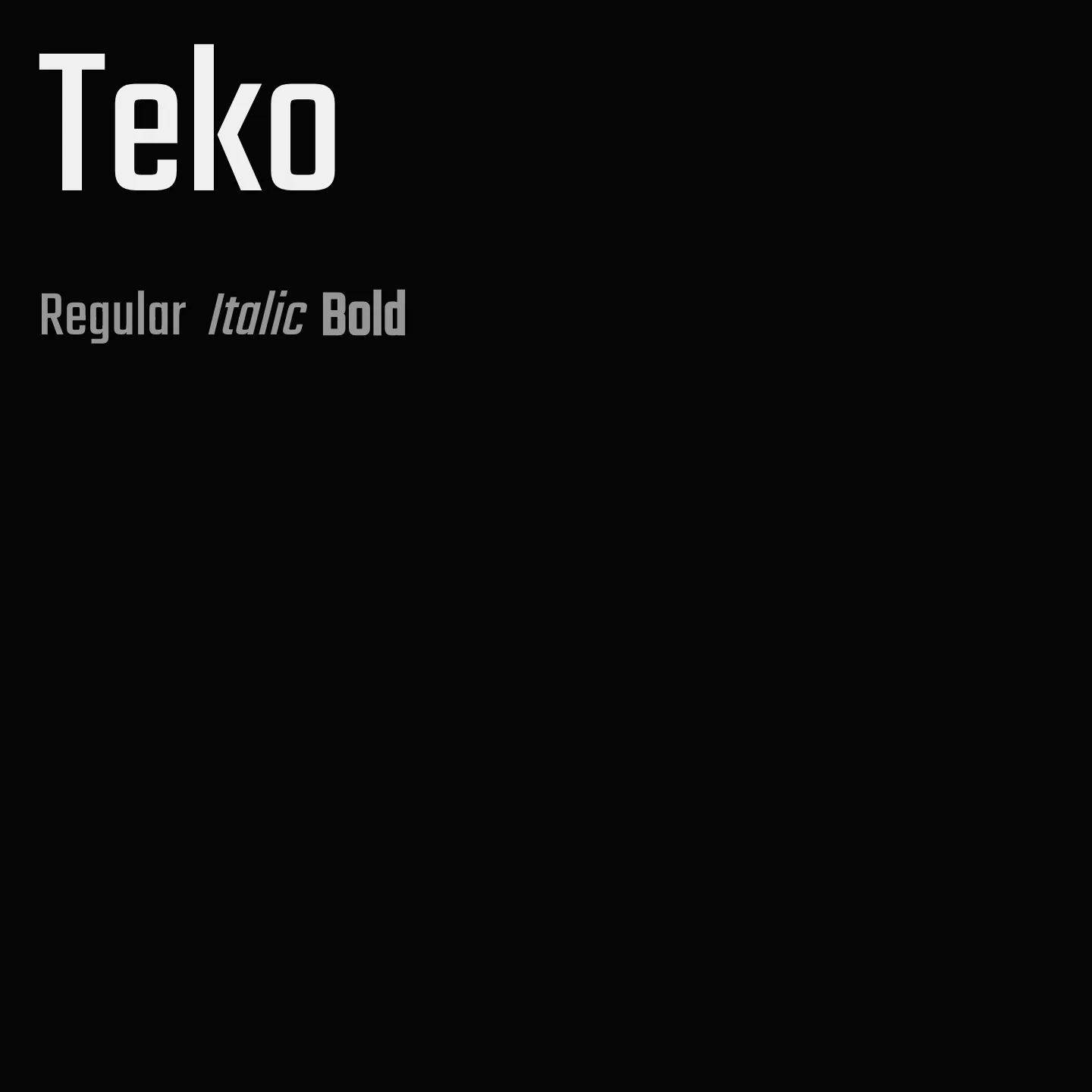
Teko features low stroke contrast and square proportions, making it visually simple and effective for display text. It includes five weights from Light to Bold and supports extensive character sets for Devanagari and Latin scripts. The family is optimized for headlines, advertising, and news tickers, working well both on screen and in print.
Overview
Teko is a variable sans-serif typeface designed primarily for headlines and other display-sized text. It offers five weights ranging from Light to Bold, with low stroke contrast and square letterforms that create a clean, simple structure. The font supports both Devanagari and Latin scripts with a large glyph set, including conjuncts and ligatures needed for Indian languages. Its design suits advertising, news tickers, and large headlines on websites, performing well in both digital and print environments. The Light, Regular, Medium, and Semibold weights are recommended for longer headlines, while the Bold weight is best for short, impactful words.
Designer: Manushi Parikh
Similar fonts:
- Poppins
- Squada One
- Homenaje
Usage
"" Access one-stop/teko using the OneStop MCP.If you do not have the OneStop MCP, read the MCP setup docs.