Media
About
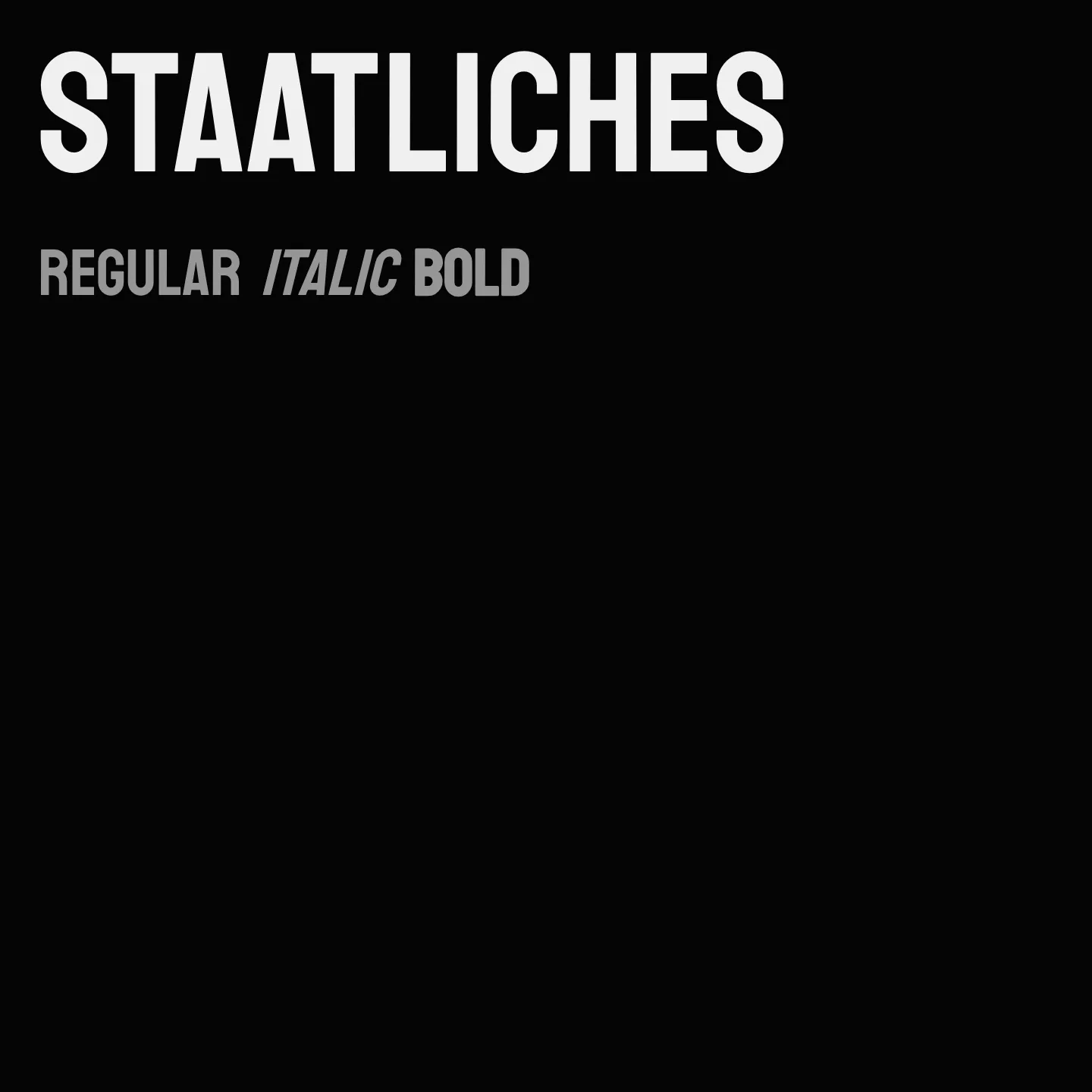
Staatliches is a clean-cut display font featuring charmingly unconventional proportions inspired by Herbert Bayer’s lettering for the first Bauhaus exhibition catalogue in 1923. It includes full sets of capitals, numbers, punctuation, symbols, alternate widths, discretionary ligatures, and common Latin accents, making it versatile for striking headlines and display use.
Overview
Staatliches is a display typeface designed with a nod to Bauhaus aesthetics, characterized by its unique and unconventional letter proportions. It offers a full complement of uppercase letters, numerals, punctuation, and symbols, alongside alternate widths and discretionary ligatures to enhance typographic expression. This font is well-suited for impactful titles and display settings where a modern yet historically influenced style is desired.
Designers: Brian LaRossa, Erica Carras
Complementary fonts:
- Use DM Sans for headlines with Staatliches for body text.
Usage
"" Access one-stop/staatliches using the OneStop MCP.If you do not have the OneStop MCP, read the MCP setup docs.