Media
About
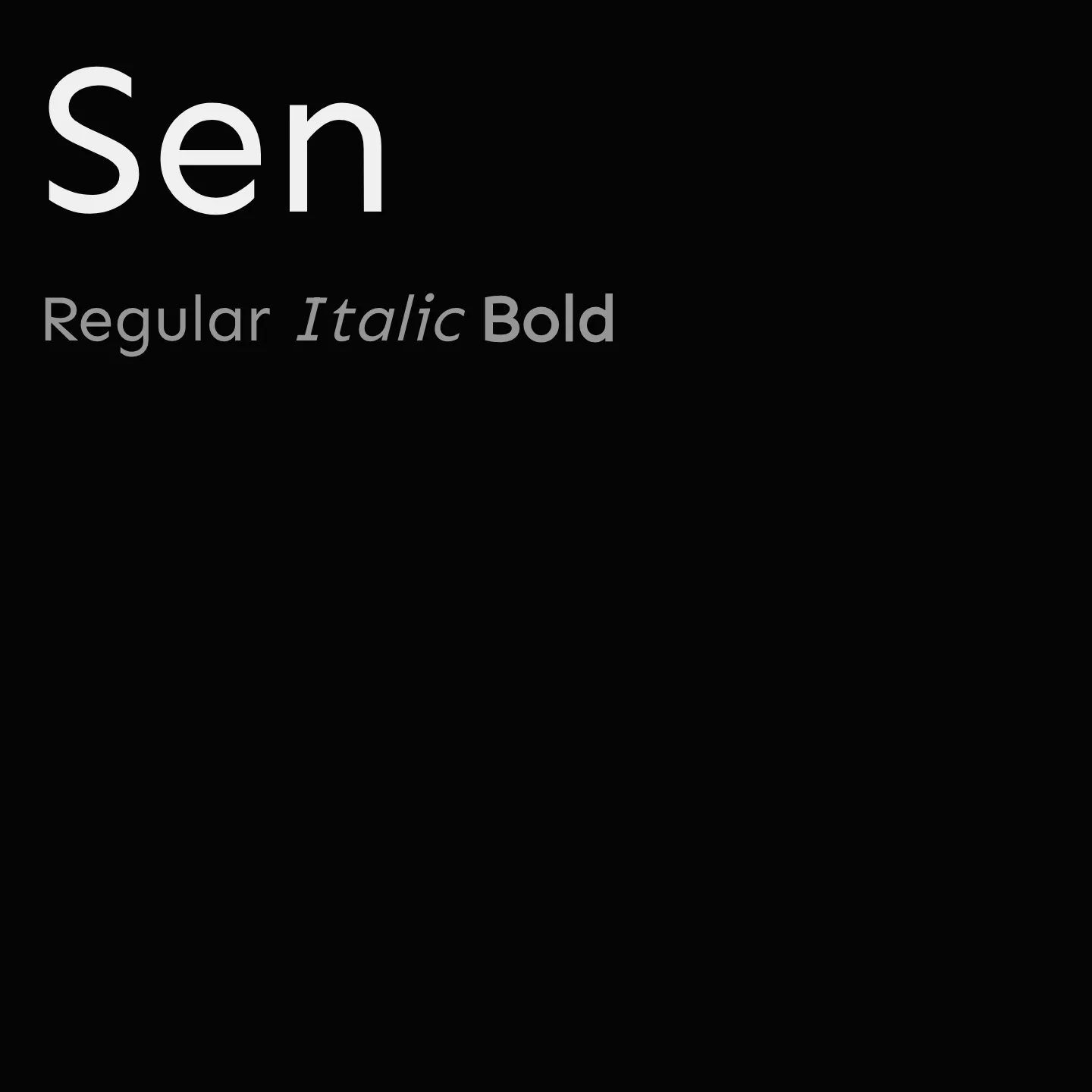
Sen is a Geohumanist sans-serif font family designed by Kosal Sen, featuring a geometric construction combined with a friendly, sensible appearance. It offers a variable weight range from Regular to ExtraBold, making it versatile for various design needs. Sen is easy to read and serves as a neutral alternative to geometric classics, balancing modernity with approachability.
Overview
Sen is a geometrically constructed sans-serif typeface with a humanist influence, designed to be unassuming and highly legible. It bridges the gap between geometric sans-serifs like Avenir or Futura and more humanist designs, resulting in a font that is both unique and easy on the eyes. The family includes multiple weights from 400 to 800, all in a normal style, and is available as a variable font, allowing smooth weight transitions. This makes Sen suitable for a wide range of applications, from body text to display use, where clarity and neutrality are desired.
Designer: Kosal Sen
Usage
"" Access one-stop/sen using the OneStop MCP.If you do not have the OneStop MCP, read the MCP setup docs.