Media
About
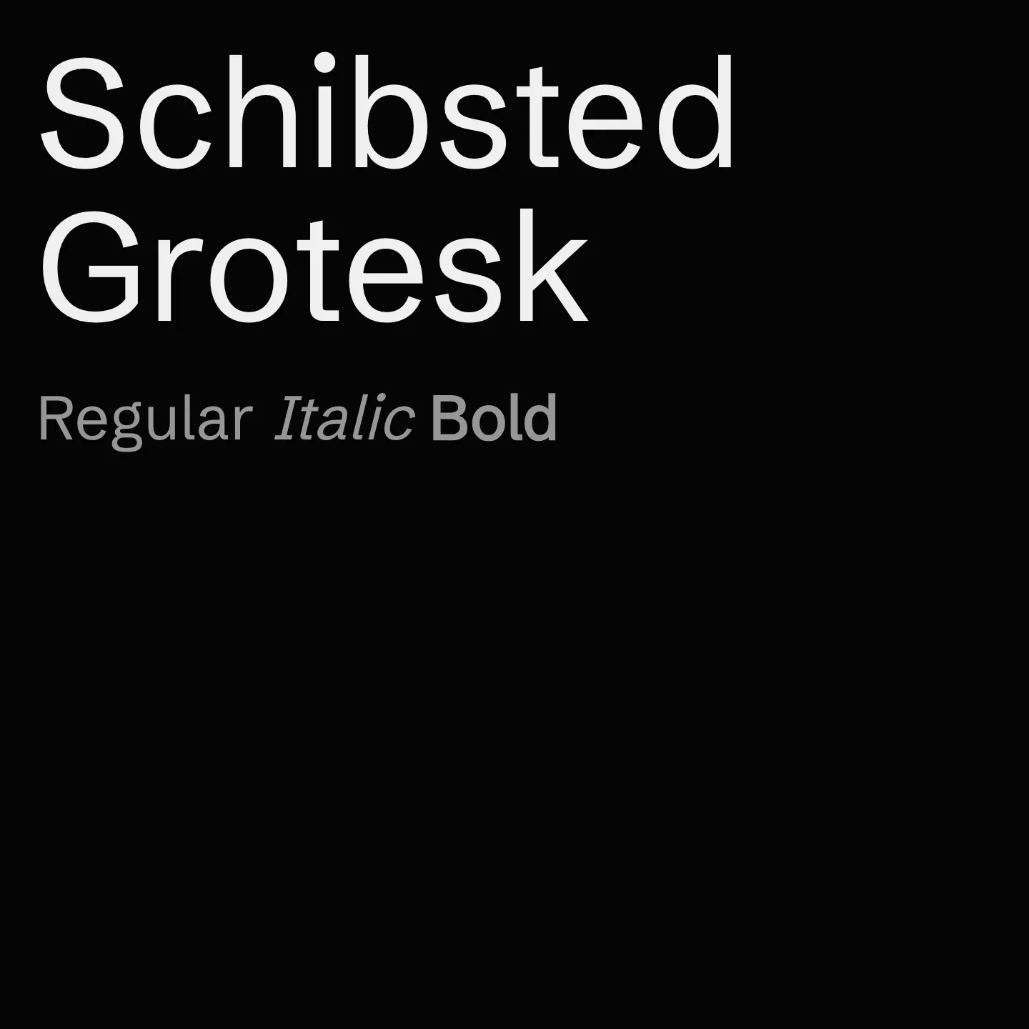
Schibsted Grotesk draws inspiration from Schibsted's legacy in print and digital media, crafted to empower brand communication and enhance user experience. It supports a wide range of weights from 400 to 900, includes italic styles, and covers extended Latin character sets, making it suitable for diverse digital applications.
Overview
Schibsted Grotesk is a digital-first sans-serif typeface family designed specifically for user interfaces. It combines influences from traditional printed media and modern digital aesthetics to create a functional and expressive tool for branding and communication. The family includes multiple weights ranging from regular to black, with corresponding italics, and supports extended Latin character sets. Its variable font capabilities allow for flexible weight adjustments, making it adaptable to various screen environments and design needs.
Designers: Bakken & Bæck, Henrik Kongsvoll
Usage
"" Access one-stop/schibsted-grotesk using the OneStop MCP.If you do not have the OneStop MCP, read the MCP setup docs.