Media
About
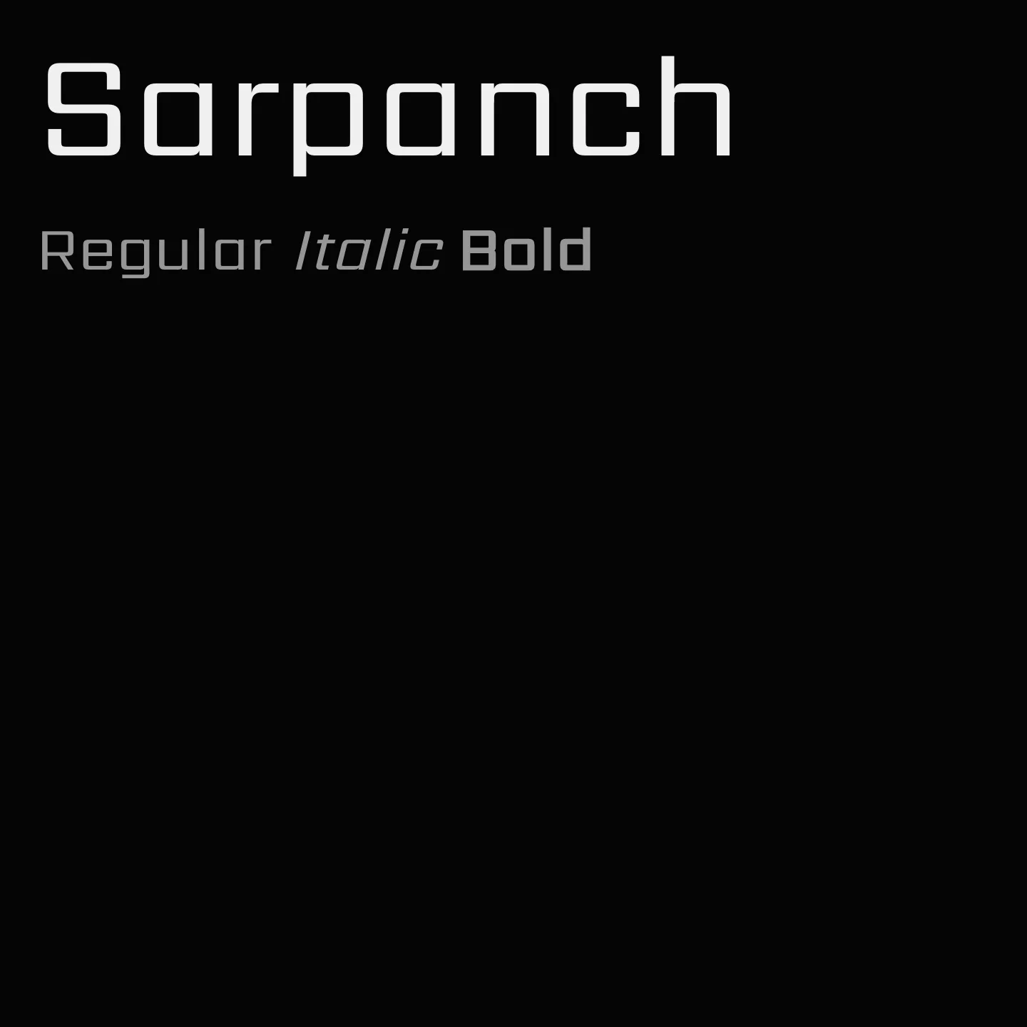
Designed for large point and pixel sizes, Sarpanch features squared construction with vertical strokes thickening across weights while horizontals remain consistent. The family includes six weights from Regular to Black, suitable for headlines and impactful single words. It supports extensive Devanagari conjuncts and ligatures, making it versatile for print and screen use.
Overview
Sarpanch is a display sans-serif typeface designed by the Indian Type Foundry, supporting both Devanagari and Latin scripts. It is characterized by wide proportions and high contrast between vertical and horizontal strokes, based on a squared construction principle. The family consists of six weights ranging from Regular to Black, with vertical stroke thickness increasing in heavier weights while horizontal strokes maintain uniform thickness. The lighter weights are recommended for short headlines, whereas the bolder weights suit single words or pairs. Each font contains over a thousand glyphs, including full support for Devanagari conjuncts and ligatures. Sarpanch performs well in both print and digital environments, making it suitable for advertising and news tickers. In Hindi, "Sarpanch" means the head of a village.
Designer: Indian Type Foundry
Usage
"" Access one-stop/sarpanch using the OneStop MCP.If you do not have the OneStop MCP, read the MCP setup docs.