Media
About
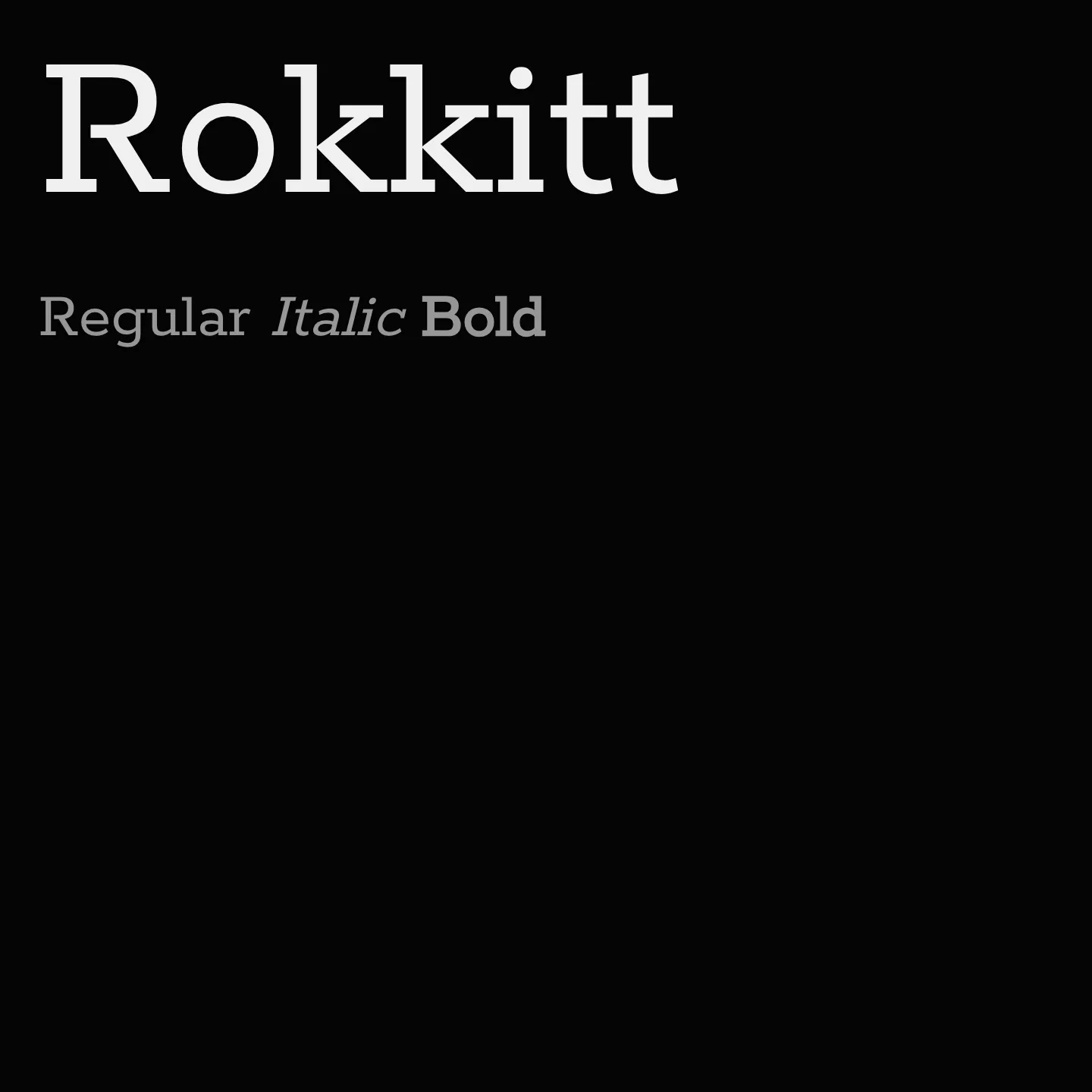
Rokkitt is a geometric slab serif inspired by early 20th-century Egyptian typefaces, designed by Vernon Adams. It features nine weights with italics and supports extended Latin scripts, making it suitable for headings, editorial work, and long-form reading. The family has been updated to include variable font support and offers flexibility for typographic hierarchy.
Overview
Rokkitt was initiated by Vernon Adams, drawing inspiration from distinctive geometric slab serifs popular in the late 19th and early 20th centuries. Originally developed from 2011 to 2014 and later expanded, it includes nine weights from thin to black, plus italics and variable font axes. While intended primarily for display and headlines, Rokkitt also functions well as an alternative serif for body text, especially in editorial and brand identity contexts. Its broad language support and multiple weights provide versatility for diverse design applications.
Designers: Vernon Adams, Kalapi Gajjar
Complementary fonts:
- Use Rokkitt for display with IBM Plex Sans for supporting text.
Similar fonts:
- Kameron
- Trocchi
Usage
"" Access one-stop/rokkitt using the OneStop MCP.If you do not have the OneStop MCP, read the MCP setup docs.