Media
About
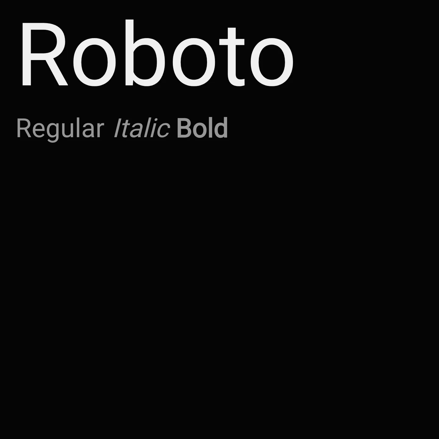
Roboto features a mechanical skeleton with largely geometric forms balanced by open curves, allowing letters to maintain natural widths and a comfortable reading rhythm. It supports multiple weights and styles, including variable font axes for weight and width, making it suitable for diverse design contexts from body text to display.
Overview
Roboto is a sans-serif typeface designed with a dual nature: a mechanical skeleton and geometric forms paired with friendly, open curves. This balance allows for natural letter widths and a reading rhythm more typical of humanist and serif types. The family includes a wide range of weights from Thin (100) to Black (900), with both normal and italic styles. It has been upgraded to a variable font supporting weight and width axes, closely matching its static predecessors and the Roboto Condensed family. Its extensive character set covers Latin, Cyrillic, Greek, Vietnamese, and mathematical symbols, making it highly versatile for global use.
Designers: Christian Robertson, ParaType, Font Bureau
Complementary fonts:
- Use Roboto Slab or Anton for headlines with Roboto for body text.
Similar fonts:
- Cousine
- Oswald
- Rubik
- Anton
- Share
Usage
"" Access one-stop/roboto using the OneStop MCP.If you do not have the OneStop MCP, read the MCP setup docs.