Media
About
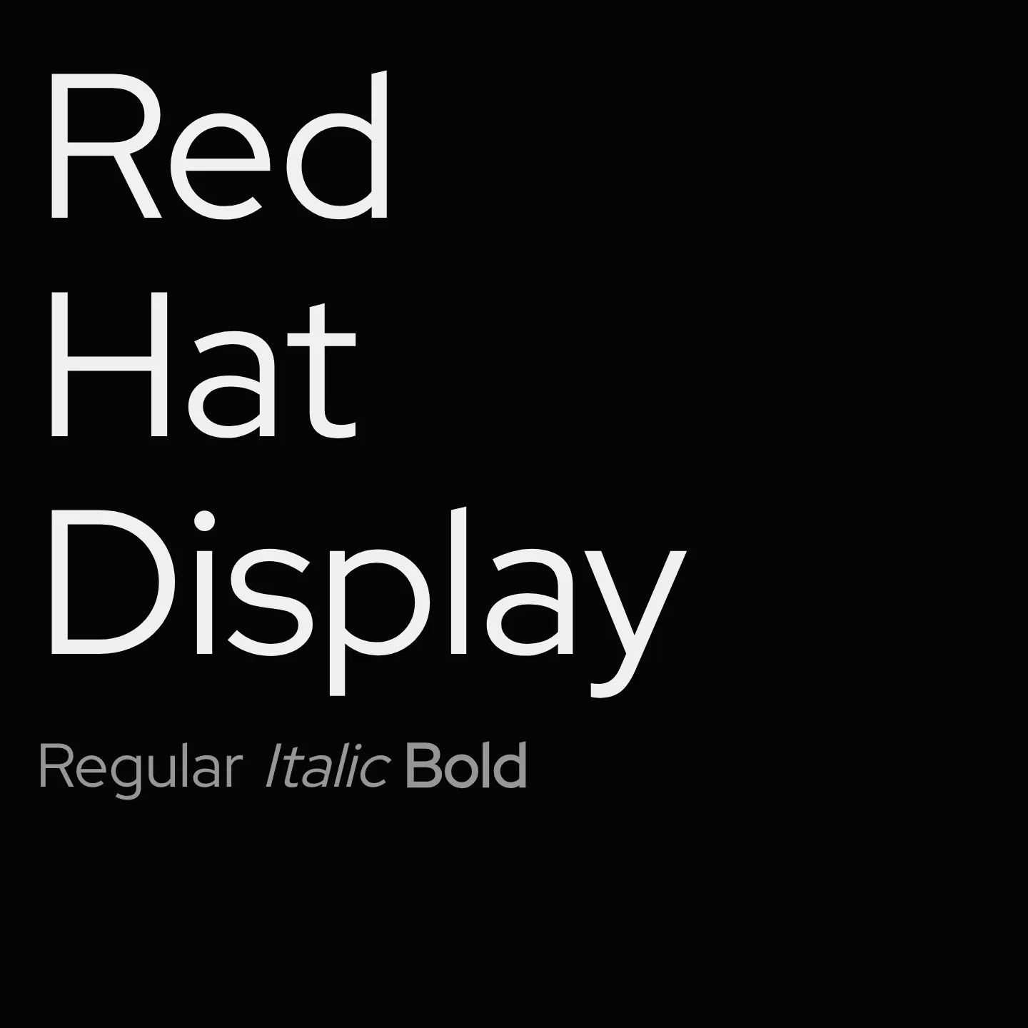
Red Hat Display is a geometric sans-serif typeface family designed with two optical sizes and a monospace style, offering a wide range of weights from light to black, including italics. It features low contrast, tight spacing, a large x-height, and open counters, making it ideal for display purposes. The family was created to complement its Text counterpart, allowing seamless use across various sizes and contexts. It supports Latin and Latin Extended scripts and includes variable font axes for weight adjustment.
Overview
Red Hat Display is a fresh take on the geometric sans genre, inspired by American sans serifs such as Tempo and Highway Gothic. Its display styles emphasize low contrast and tight spacing with a large x-height and open counters, optimized for impactful headlines and signage. The family includes weights from 300 to 900 and supports both normal and italic styles. It was originally commissioned by Paula Scher and Pentagram and designed by Jeremy Mickel (MCKL) for the Red Hat identity. The family has been upgraded to variable fonts with a weight axis, enhancing flexibility and fluidity across weights. The Display and Text styles can be combined seamlessly for versatile typographic systems. Designers seeking a modern, geometric sans-serif with robust weight options and clear legibility at large sizes will find Red Hat Display well suited to their needs.
Designer: Jeremy Mickel
Usage
"" Access one-stop/red-hat-display using the OneStop MCP.If you do not have the OneStop MCP, read the MCP setup docs.