Media
About
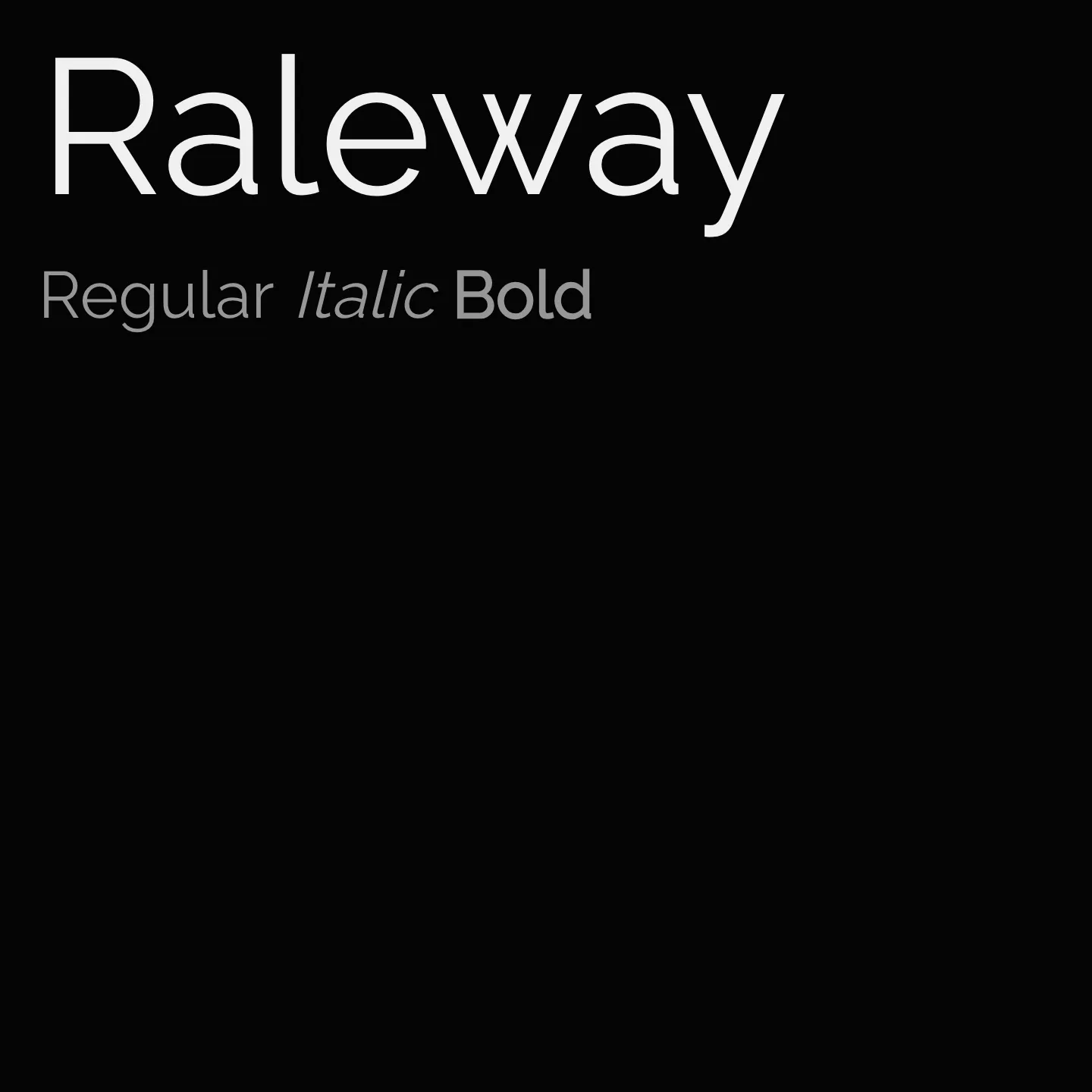
Raleway began as a single thin weight and expanded into a comprehensive family with nine weights and italics. It features both old style and lining numerals, discretionary ligatures, and stylistic alternates inspired by geometric sans-serifs. Its design suits modern display typography with a refined and clean aesthetic.
Overview
Raleway is an elegant sans-serif typeface family originally designed by Matt McInerney and later expanded by Pablo Impallari and Rodrigo Fuenzalida. It includes nine weights from thin to black, each with italic styles, and supports a broad range of Latin, Cyrillic, and Vietnamese characters. The family offers both old style and lining numerals, discretionary ligatures, and stylistic alternates that add versatility. It is primarily intended as a display face, combining modern geometric influences with neo-grotesque roots. Raleway also has a sister family named Raleway Dots, which features a dotted style variant. Designers often use Raleway for headlines and branding where a clean, elegant sans-serif is desired.
Designers: Matt McInerney, Pablo Impallari, Rodrigo Fuenzalida
Complementary fonts:
- Use Raleway for display with Open Sans for supporting text.
- Use Playfair Display or Merriweather for headlines with Raleway for body text.
Similar fonts:
- Montserrat Alternates
Usage
"" Access one-stop/raleway using the OneStop MCP.If you do not have the OneStop MCP, read the MCP setup docs.