Media
About
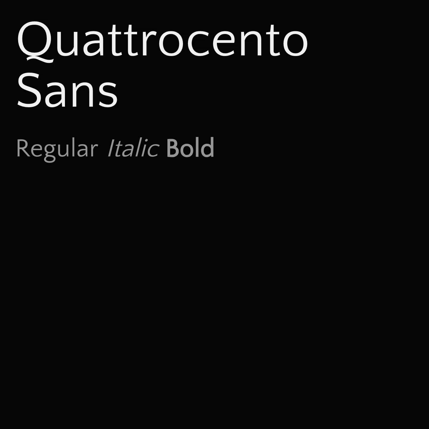
Quattrocento Sans features warm, wide, and open letterforms with a large x-height, making it highly legible for body text at small sizes while retaining subtle details suitable for display use. It pairs naturally with its serif counterpart, Quattrocento, offering a harmonious typographic combination. The family includes regular and bold weights with italic styles, supporting Latin and Latin-Extended scripts.
Overview
Quattrocento Sans is a classic, elegant, and sober sans-serif typeface family characterized by warm and readable letterforms that are not intrusive. Its wide and open shapes combined with a large x-height ensure excellent legibility for body text at small sizes. At larger sizes, the subtle design details become more apparent, making it equally effective for display purposes. This versatility makes Quattrocento Sans a reliable choice for a variety of typographic needs, from extended reading to impactful headlines.
Designer: Impallari Type
Complementary fonts:
- Use Quattrocento for headlines with Quattrocento Sans for body text.
Similar fonts:
- Overpass
Usage
"" Access one-stop/quattrocento-sans using the OneStop MCP.If you do not have the OneStop MCP, read the MCP setup docs.