Media
About
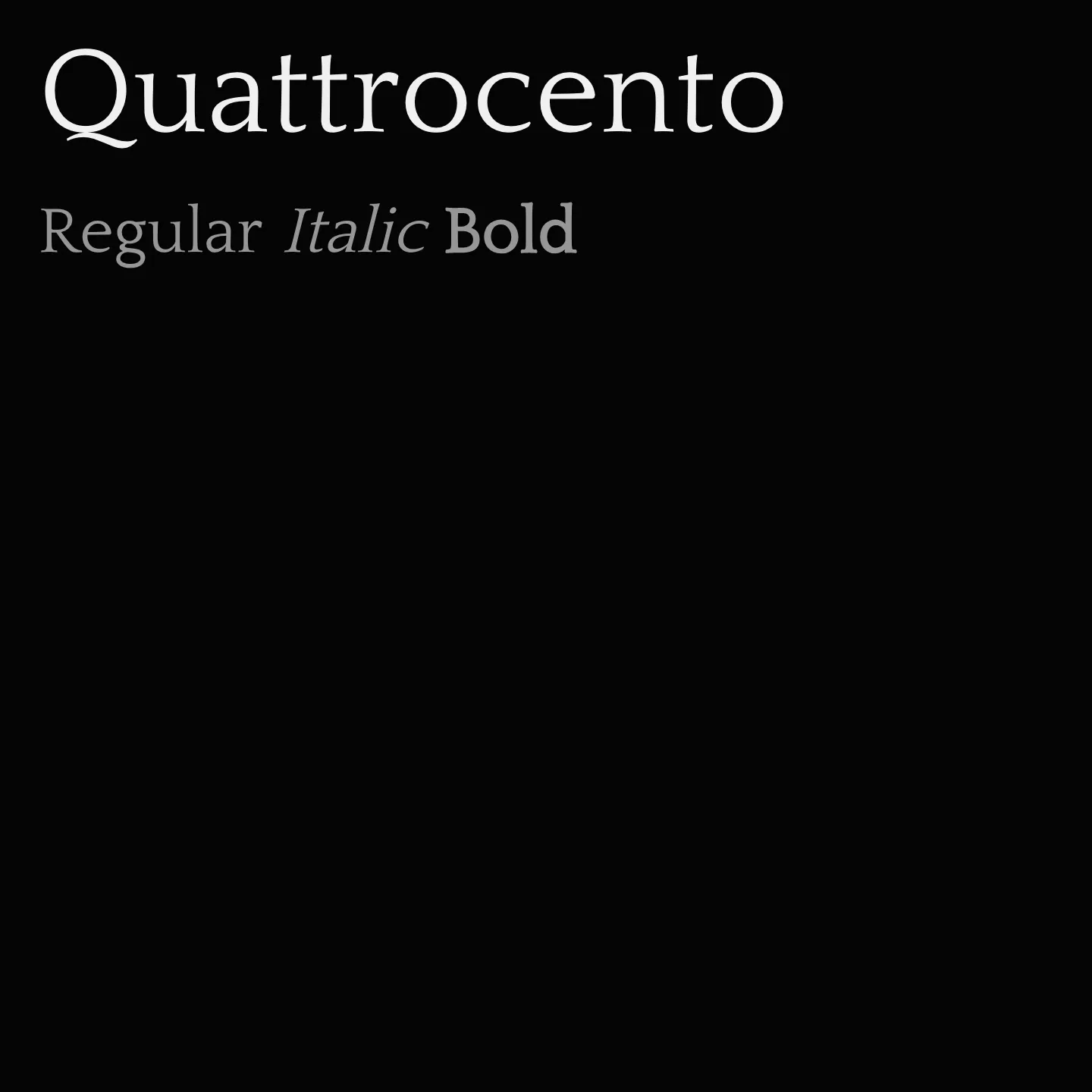
Quattrocento features low contrast strokes with cupped, tapered stems flowing naturally into serifs. It includes distinctive letterforms such as a unique K, R, and ampersand tail, along with alternate characters for M and W. Its design balances legibility at small sizes with refined details visible at larger sizes, making it versatile for various typographic needs.
Overview
Quattrocento is a classic, elegant serif typeface characterized by wide and open letterforms and a generous x-height that enhances legibility in body text at small sizes. Its low contrast stroke weight and cupped, tapered stems flow naturally into serifs, giving it a sober yet strong appearance. Distinctive features include unique shapes for letters like K, R, and the ampersand, as well as alternate forms for M and W. The design incorporates narrow L and T for better fit and almost flat top serifs on lowercase letters. Shoulders of m and n rise above the serif, and the j and y have serif-less bottoms. This typeface is also a perfect companion to Quattrocento Sans, its sans-serif counterpart, allowing for harmonious typographic combinations.
Designer: Impallari Type
Complementary fonts:
- Use Quattrocento for display with Quattrocento Sans or Fanwood Text for supporting text.
- Use Oswald for headlines with Quattrocento for body text.
Similar fonts:
- Alice
- Stoke
- Ovo
Usage
"" Access one-stop/quattrocento using the OneStop MCP.If you do not have the OneStop MCP, read the MCP setup docs.