Media
About
Port Lligat Slab features soft stroke variations, vertical stress, and heavy slab serifs with rounded terminals, creating a balanced and groovy appearance. Designed as part of a super family, it matches exactly in weight and width with its sans counterpart, allowing versatile typographic combinations. It performs well both on screen and in print, especially at small sizes where it retains readability and character.
Overview
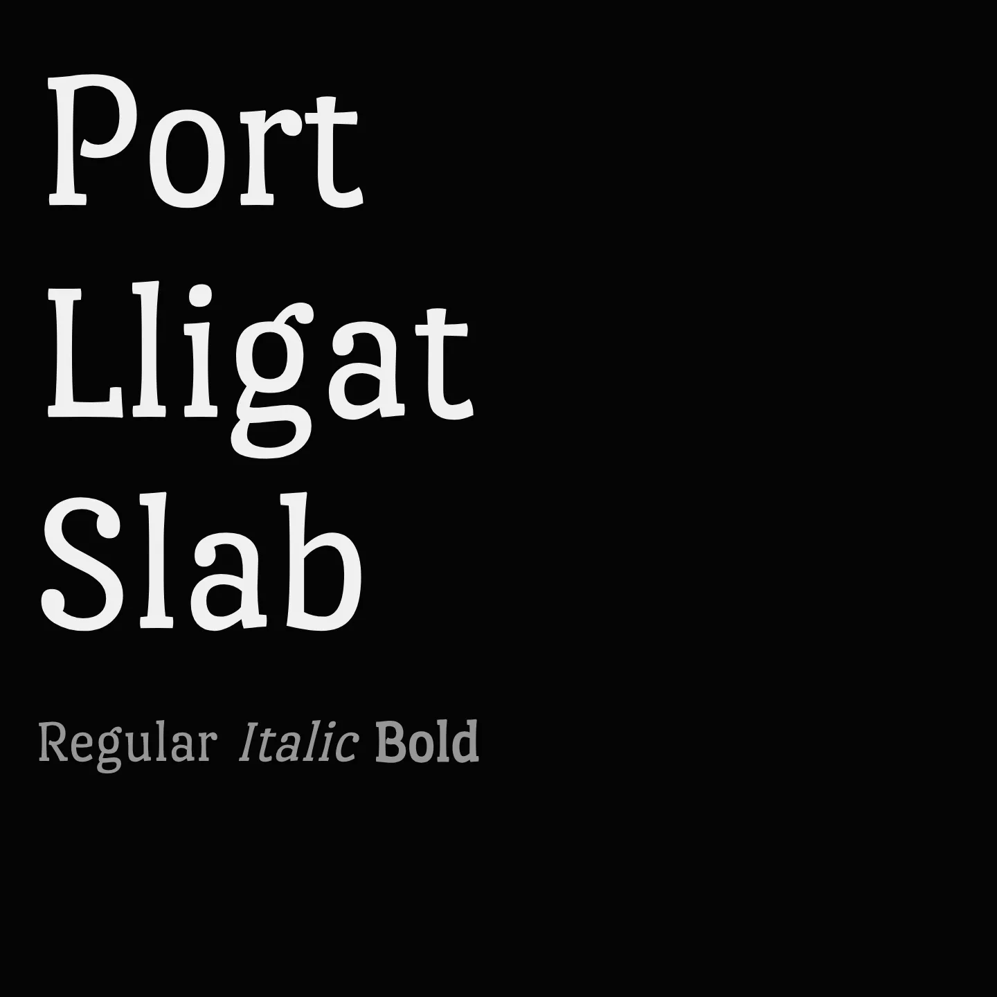
Port Lligat Slab is a display serif typeface characterized by its condensed structure, vertical stress, and a rhythmic flow that balances softness and strength. Its heavy slab serifs and rounded terminals give it a unique groovy style, making it suitable for both headlines and short text blocks. The typeface is designed to pair seamlessly with its sans family counterpart, sharing identical weight and width metrics, which allows for flexible typographic hierarchies and cohesive design systems. It remains comfortable to read on screen, even at smaller sizes, where it takes on a groovy serif appearance.
Designer: Tipo
Similar fonts:
- Kreon
- Sura
- Sumana
Usage
"" Access one-stop/port-lligat-slab using the OneStop MCP.If you do not have the OneStop MCP, read the MCP setup docs.