Media
About
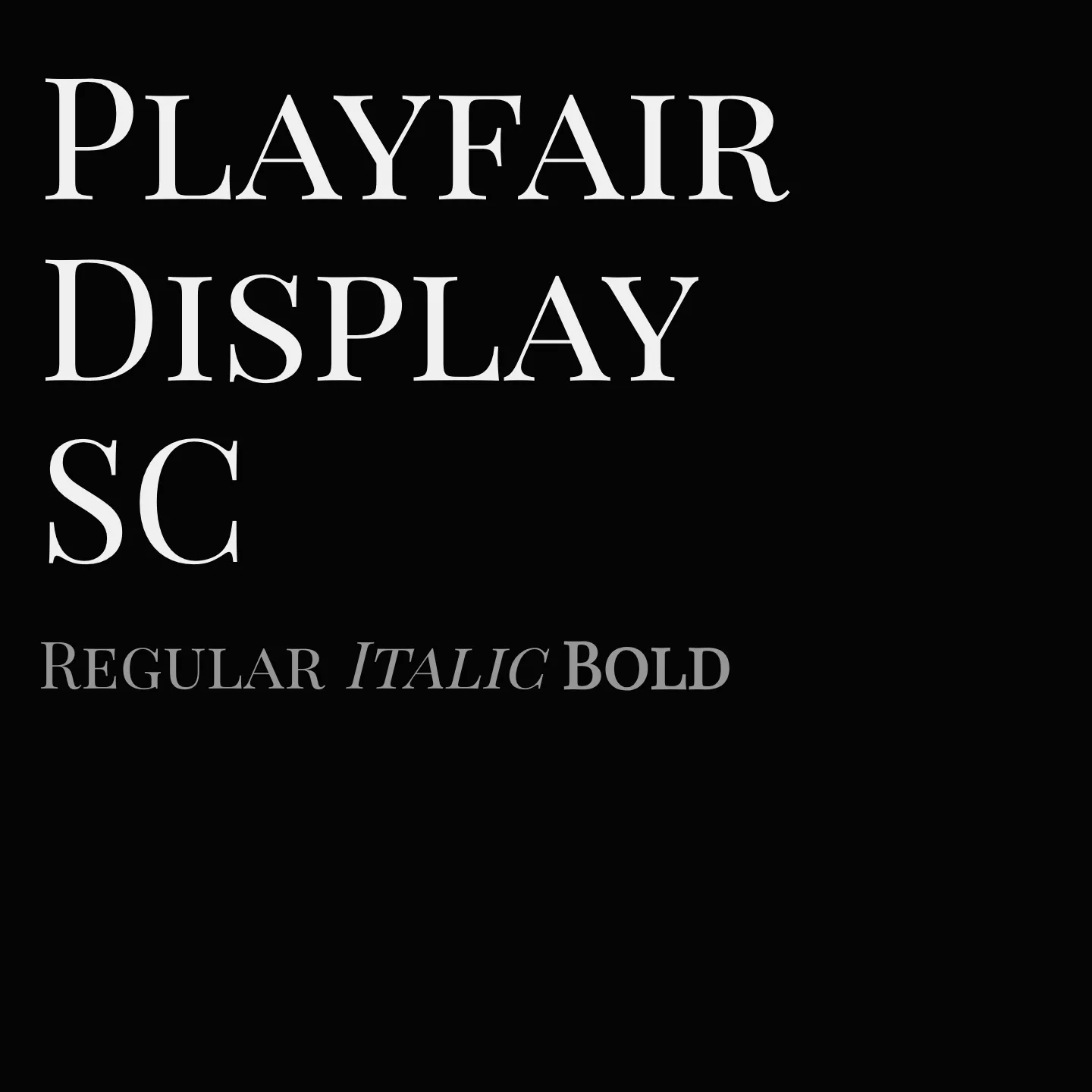
Playfair Display SC is a serif typeface designed by Claus Eggers Sørensen, reflecting the transitional style popularized in the late 18th century. It features high contrast and delicate hairlines influenced by John Baskerville and Scotch Roman designs. This small caps sibling to Playfair Display is suited for display settings and pairs well with text fonts like Georgia or Gelasio.
Overview
Playfair Display SC is a transitional serif font family that embodies the typographic evolution of the European Enlightenment, when pointed steel pens replaced broad nib quills. Its design emphasizes high contrast and refined hairlines, drawing inspiration from John Baskerville and Scotch Roman styles. Intended primarily for display use, it complements body text fonts such as Georgia or Gelasio. This family includes small caps and offers styles in regular, italic, bold, and black weights.
Designer: Claus Eggers Sørensen
Similar fonts:
- Cinzel
- Cormorant SC
Usage
"" Access one-stop/playfair-display-sc using the OneStop MCP.If you do not have the OneStop MCP, read the MCP setup docs.