Media
About
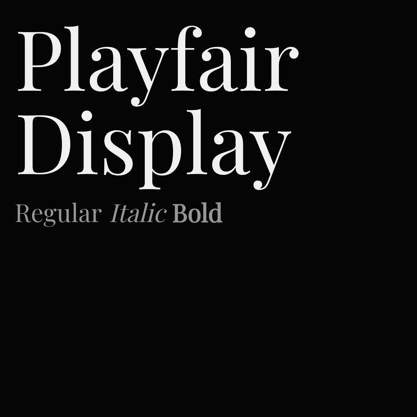
Playfair Display is a transitional serif font inspired by late 18th-century European Enlightenment typography, featuring high contrast and delicate hairlines. It is suited for large-size display settings and pairs well with classic serif and modern sans-serif fonts for body text. The family includes multiple weights and styles, supporting Latin and Cyrillic scripts.
Overview
Playfair Display is a transitional serif typeface reflecting the shift from broad nib quills to pointed steel pens in the late 18th century. It draws influence from John Baskerville and Scotch Roman styles, offering high contrast and delicate hairlines ideal for display use. The family supports a wide range of weights and styles, including italics and small caps, and covers Latin, Cyrillic, and Vietnamese scripts. It pairs effectively with both serif fonts like Gelasio and Georgia for body text, as well as sans-serif fonts such as Source Sans Pro and Roboto, providing versatility in typographic design.
Designer: Claus Eggers Sørensen
Complementary fonts:
- Use Playfair Display for display with Source Sans Pro or Roboto for supporting text.
Similar fonts:
- Unna
Usage
"" Access one-stop/playfair-display using the OneStop MCP.If you do not have the OneStop MCP, read the MCP setup docs.