Media
About
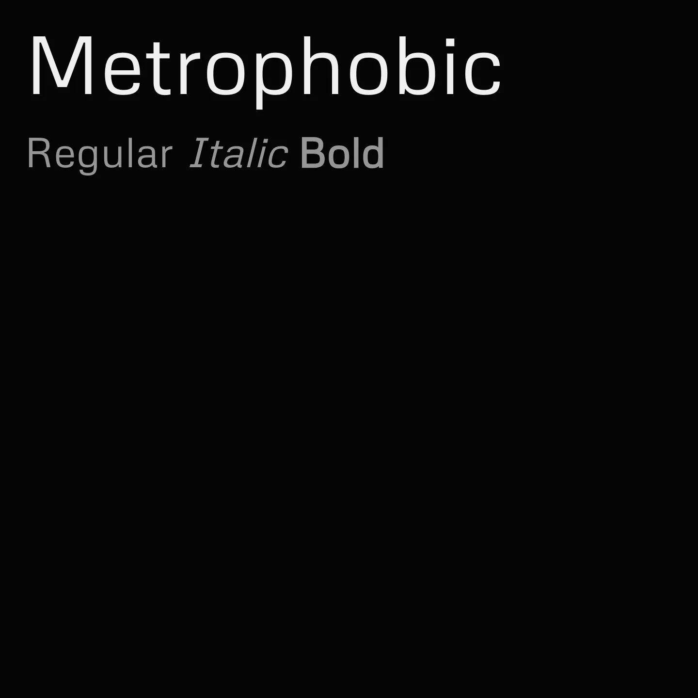
Metrophobic is a sans serif typeface with a semi-geometric style, crafted to maintain clarity at small sizes while offering enough personality for headers and headlines. It supports Latin, Latin Extended, and Vietnamese scripts, making it versatile for diverse text bodies and display purposes. The design was refined in 2019 and updated in 2023 to enhance readability and expand language support.
Overview
Metrophobic is a sans serif face with a semi geometric feel. It is designed to be legible at small text sizes but also have enough character to be used as an interesting display face for headers and headlines. It can also be used for text bodies. Updated June 2019 to v3.100: Redrawn and respaced to improve the design quality. Updated January 2023 to v3.200: The glyphset has been expanded and now supports Vietnamese language. The overall horizontal space has been adjusted for better readability. The Metrophobic project was commissioned by Google from Vernon Adams, an English type designer who lived in San Clemente, Los Angeles, USA.
Designer: Vernon Adams
Similar fonts:
- Palanquin
- Varela
- Numans
Usage
"" Access one-stop/metrophobic using the OneStop MCP.If you do not have the OneStop MCP, read the MCP setup docs.