Media
About
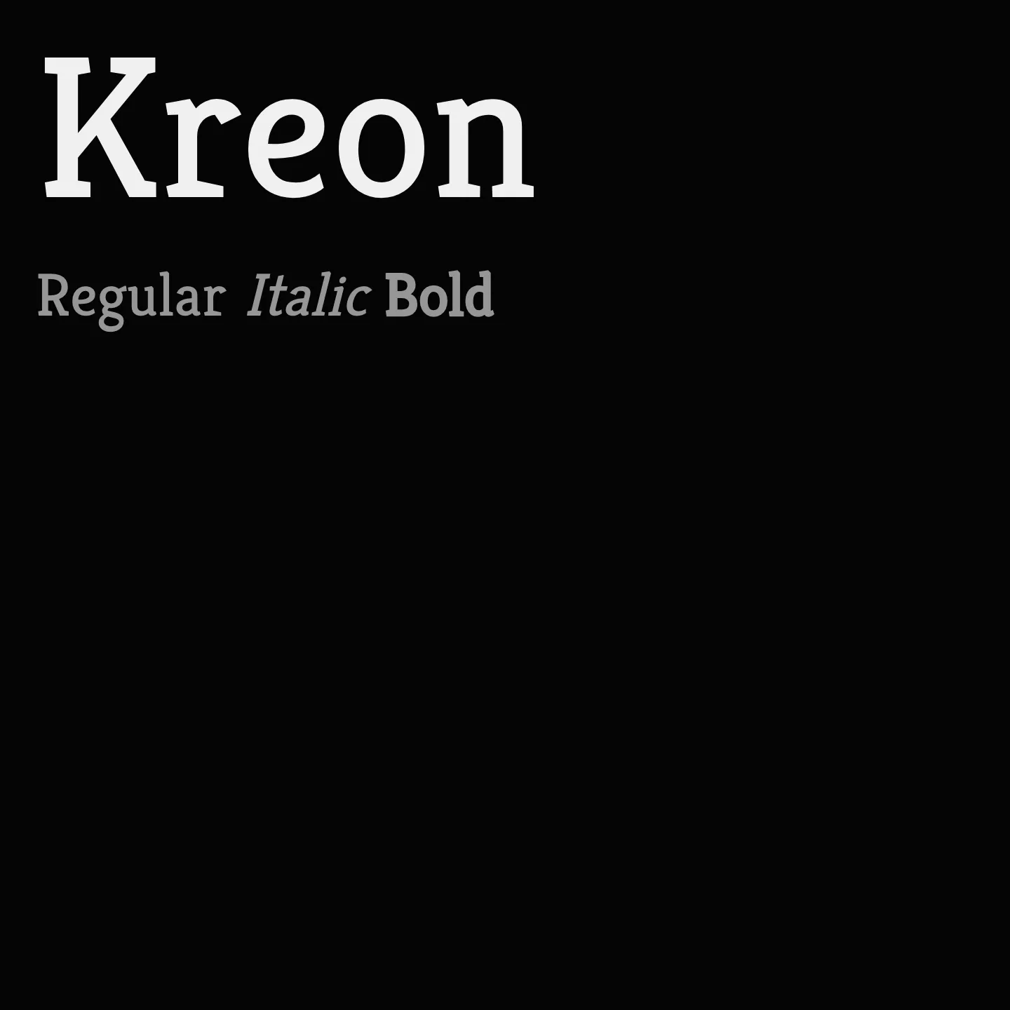
Kreon is a slab serif font family optimized for magazine and news site typesetting, featuring a low contrast design that ensures readability and a friendly appearance. It supports Latin and Latin Extended scripts with multiple weights from 300 to 700 and includes variable font capabilities. The family currently offers normal styles, with plans for sans serif and italic versions.
Overview
Kreon is a slab serif typeface tailored for comfortable reading in magazines, news sites, blogs, and online magazines. Its low contrast and slightly slabbed serifs provide a sturdy yet approachable texture for text. The family includes weights from light to bold and supports Latin and Latin Extended characters. It is available as a variable font, allowing flexible weight adjustments. Future expansions will include a sans serif companion and italic styles, enhancing its versatility for editorial and web use.
Designer: Julia Petretta
Similar fonts:
- Port Lligat Slab
- Prociono
- Sumana
Usage
"" Access one-stop/kreon using the OneStop MCP.If you do not have the OneStop MCP, read the MCP setup docs.