Media
About
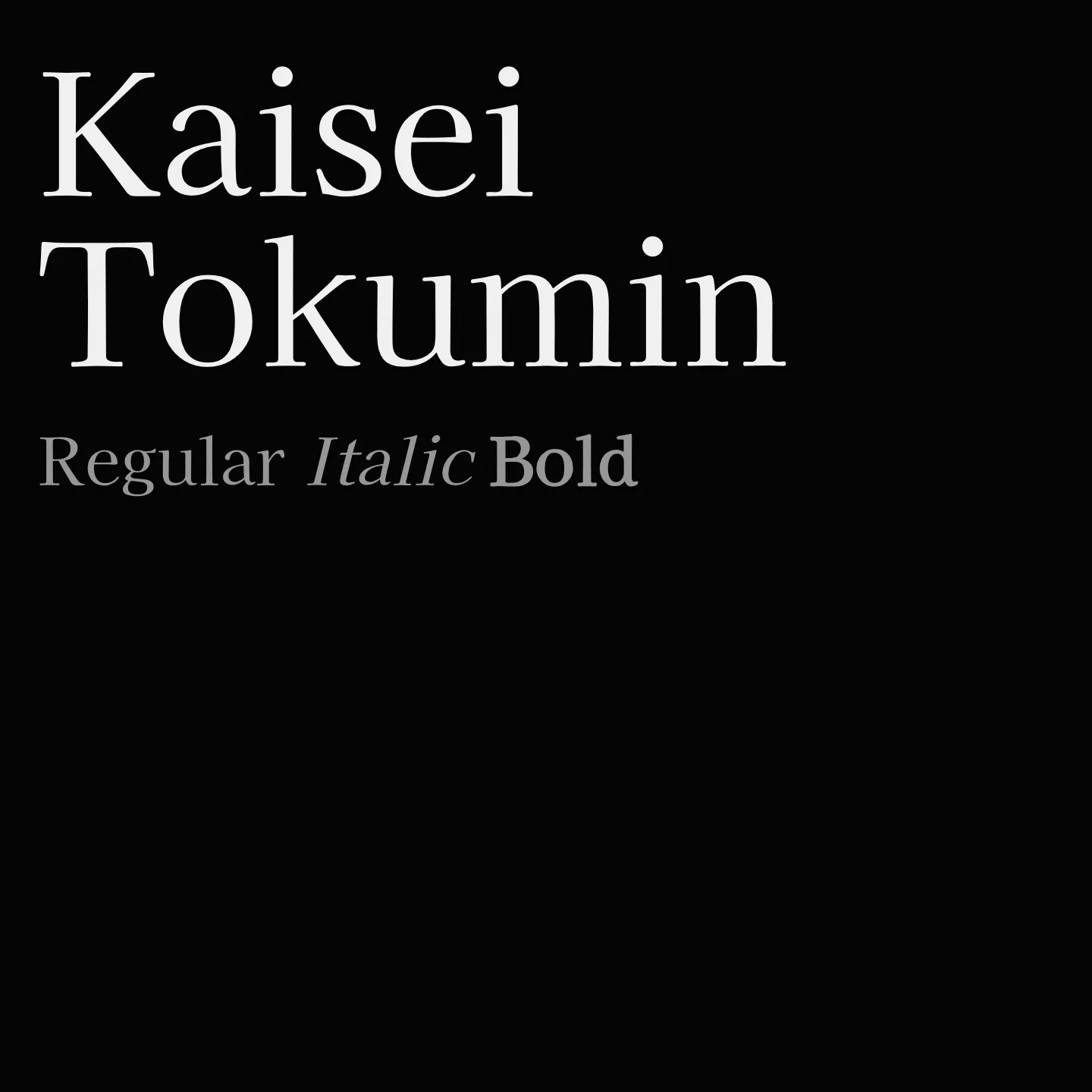
Kaisei Tokumin is a serif font family featuring extra bold weights that maintain legibility and visual balance, avoiding the heaviness that can obscure word clarity. It supports Latin, Latin Extended, Cyrillic, and Japanese scripts, making it versatile for multilingual display use. The design emphasizes strong title presence without sacrificing readability.
Overview
Kaisei Tokumin is a serif typeface crafted to deliver powerful and clear titles with an extra bold weight. It addresses common issues in heavy serif fonts by preserving the breathing space around glyphs, ensuring words remain distinct and legible. The family includes multiple weights and supports a broad range of scripts, including Latin, Cyrillic, and Japanese, making it suitable for diverse typographic needs where strong emphasis is required. Its design balances density and clarity, making it ideal for impactful headings and display text.
Designer: Font-Kai
Usage
"" Access one-stop/kaisei-tokumin using the OneStop MCP.If you do not have the OneStop MCP, read the MCP setup docs.