Media
About
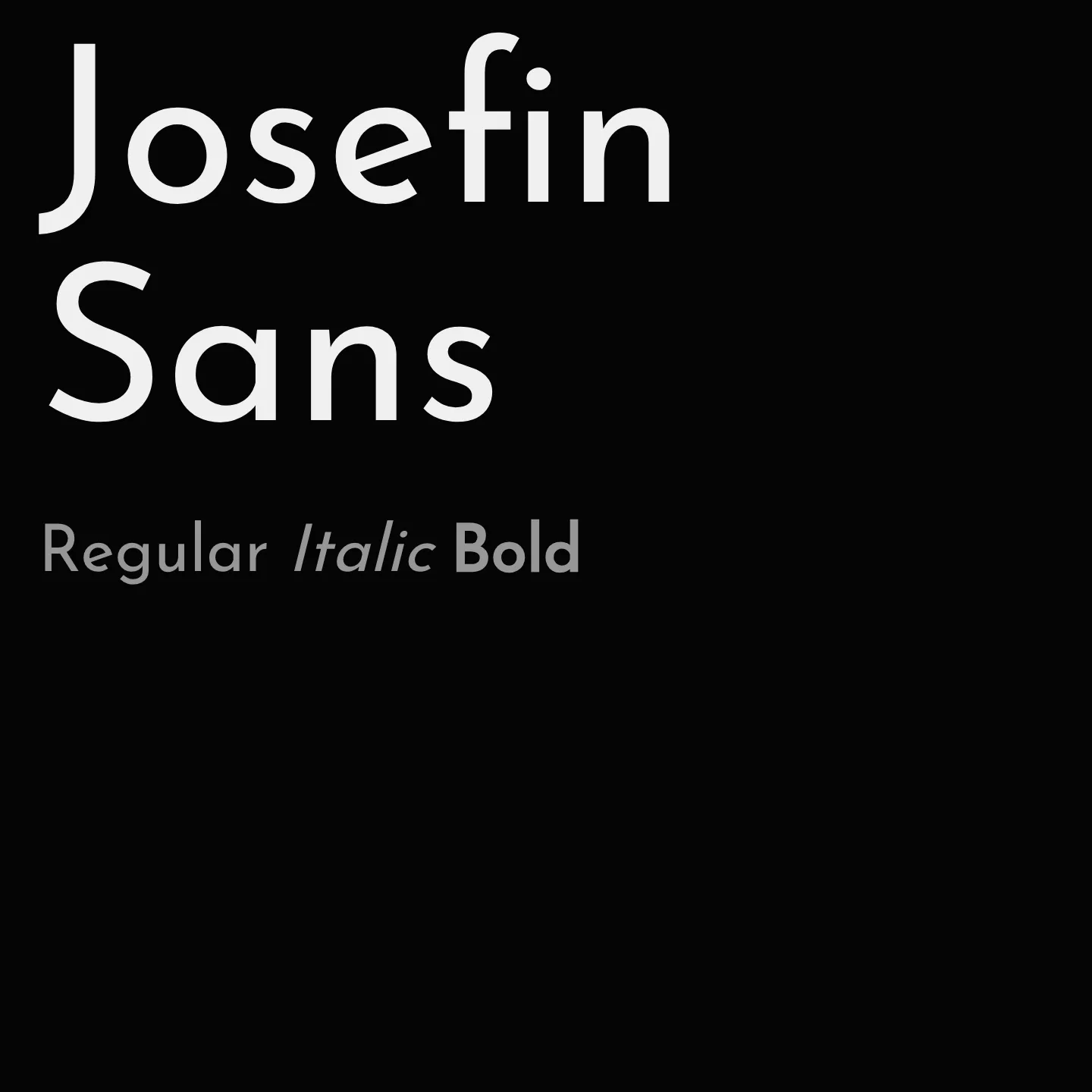
Josefin Sans features a distinctive x-height set halfway between the baseline and cap height, creating an unusual and refined proportion. It offers a range of weights from 100 to 700, including italic styles, and supports Latin, Latin Extended, and Vietnamese scripts. The family was updated in 2019 to include a variable font weight axis, enhancing its versatility for modern typography.
Overview
Josefin Sans is a geometric sans-serif typeface inspired by 1920s designs, characterized by its elegant and vintage aesthetic. Its unique x-height proportion makes it well-suited for display use at larger sizes. The family includes multiple weights and styles, with support for Latin, Latin Extended, and Vietnamese scripts. A variable font version with a weight axis was introduced in 2019, allowing flexible typographic expression.
Designer: Santiago Orozco
Complementary fonts:
- Use Yeseva One, Cardo, or Abril Fatface for headlines with Josefin Sans for body text.
Similar fonts:
- Poiret One
Usage
"" Access one-stop/josefin-sans using the OneStop MCP.If you do not have the OneStop MCP, read the MCP setup docs.