Media
About
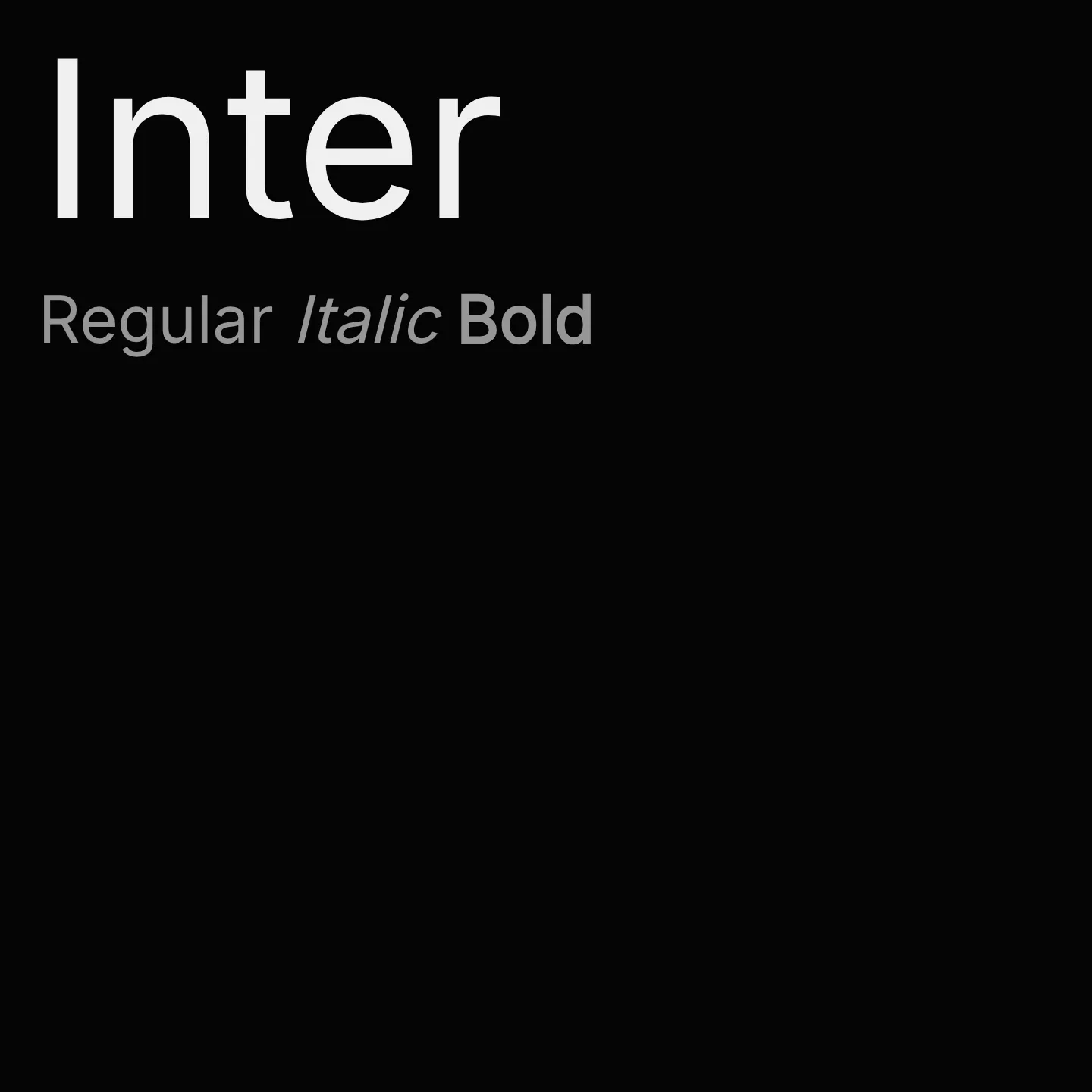
Inter is a variable font family designed specifically for computer screens, featuring a tall x-height to improve readability of mixed-case and lowercase text. It includes OpenType features such as contextual alternates, slashed zero, and tabular numbers to enhance clarity and typographic flexibility. The family supports multiple weights and styles, making it suitable for diverse digital typography needs.
Overview
Inter is a modern sans-serif typeface family crafted for clear and comfortable screen typography. It offers a wide range of weights from thin to black and includes both normal and italic styles. Its tall x-height and carefully designed letterforms aid in legibility, especially in user interfaces and digital environments. Inter supports extensive language subsets including Latin, Cyrillic, Greek, and Vietnamese, making it a global choice for digital text. The font’s variable axis allows fine control over weight and optical size, adapting well to different display contexts.
Designer: Rasmus Andersson
Complementary fonts:
- Use Voltaire, Gloock, or Special Gothic Expanded One for headlines with Inter for body text.
Usage
"" Access one-stop/inter using the OneStop MCP.If you do not have the OneStop MCP, read the MCP setup docs.