Media
About
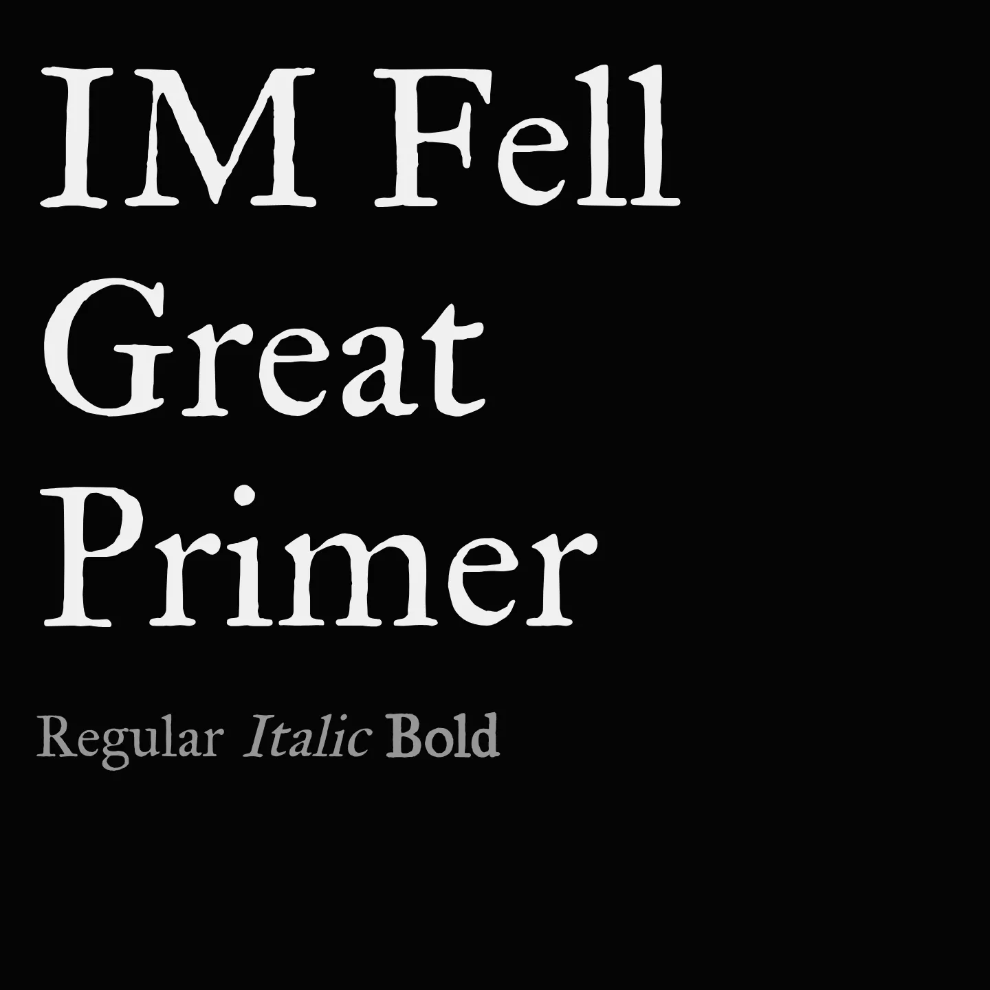
IM Fell Great Primer revives the style of the Fell Types, originally crafted in Oxford in the late 1600s. It reflects the heritage of John Fell's printing legacy and the craftsmanship of Peter De Walpergen, who cut the original punches. This serif font is well suited for text settings that seek a classical and scholarly tone.
Overview
IM Fell Great Primer is a serif font family designed to echo the historic Fell Types used by the University of Oxford's printing house. These types date back to the 17th century and were developed under the direction of John Fell, a bishop and dean who emphasized quality in English letterforms. The typeface captures the character of the Great Primer Roman and Italic sizes cut by Peter De Walpergen, a type-founder active in the late 1600s. Its design conveys a sense of tradition and learned elegance, making it appropriate for literary and academic contexts.
Designer: Igino Marini
Similar fonts:
- IM Fell Double Pica
- IM Fell DW Pica
- IM Fell English
Usage
"" Access one-stop/im-fell-great-primer using the OneStop MCP.If you do not have the OneStop MCP, read the MCP setup docs.