Media
About
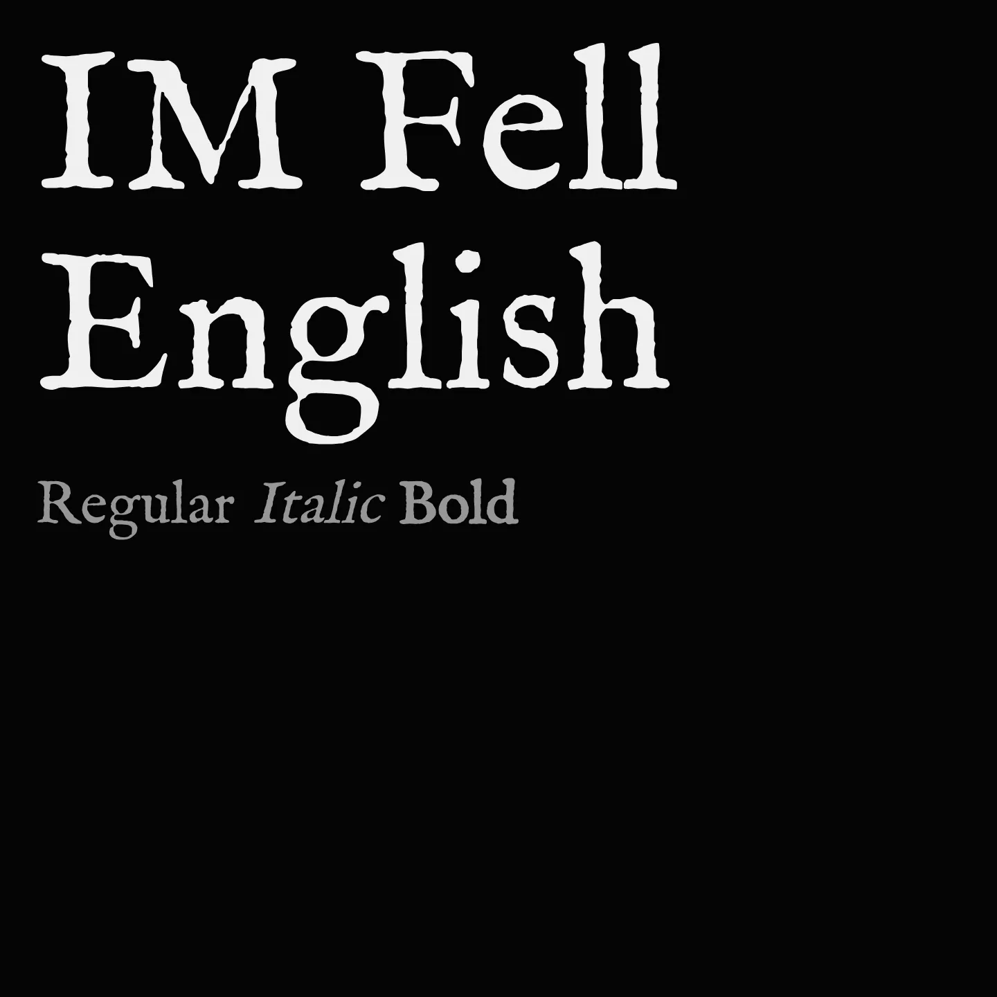
IM Fell English revives the style of the Fell Types, originally created in the late 1600s for the Oxford University Press. It reflects the craftsmanship of John Fell's printing house, combining historical authenticity with contemporary usability. The family includes normal and italic styles in a single weight, suitable for text settings that seek a classical tone.
Overview
IM Fell English is a serif font family that draws on the heritage of the Oxford Printing House's oldest surviving punches and matrices. Its design is rooted in the work of John Fell and type-founder Peter De Walpergen, embodying a 17th-century aesthetic with a scholarly character. The family offers both roman and italic styles in one weight, making it ideal for projects requiring a historic yet readable text face.
Designer: Igino Marini
Similar fonts:
- IM Fell DW Pica
- IM Fell Great Primer
- IM Fell Double Pica
Usage
"" Access one-stop/im-fell-english using the OneStop MCP.If you do not have the OneStop MCP, read the MCP setup docs.