Media
About
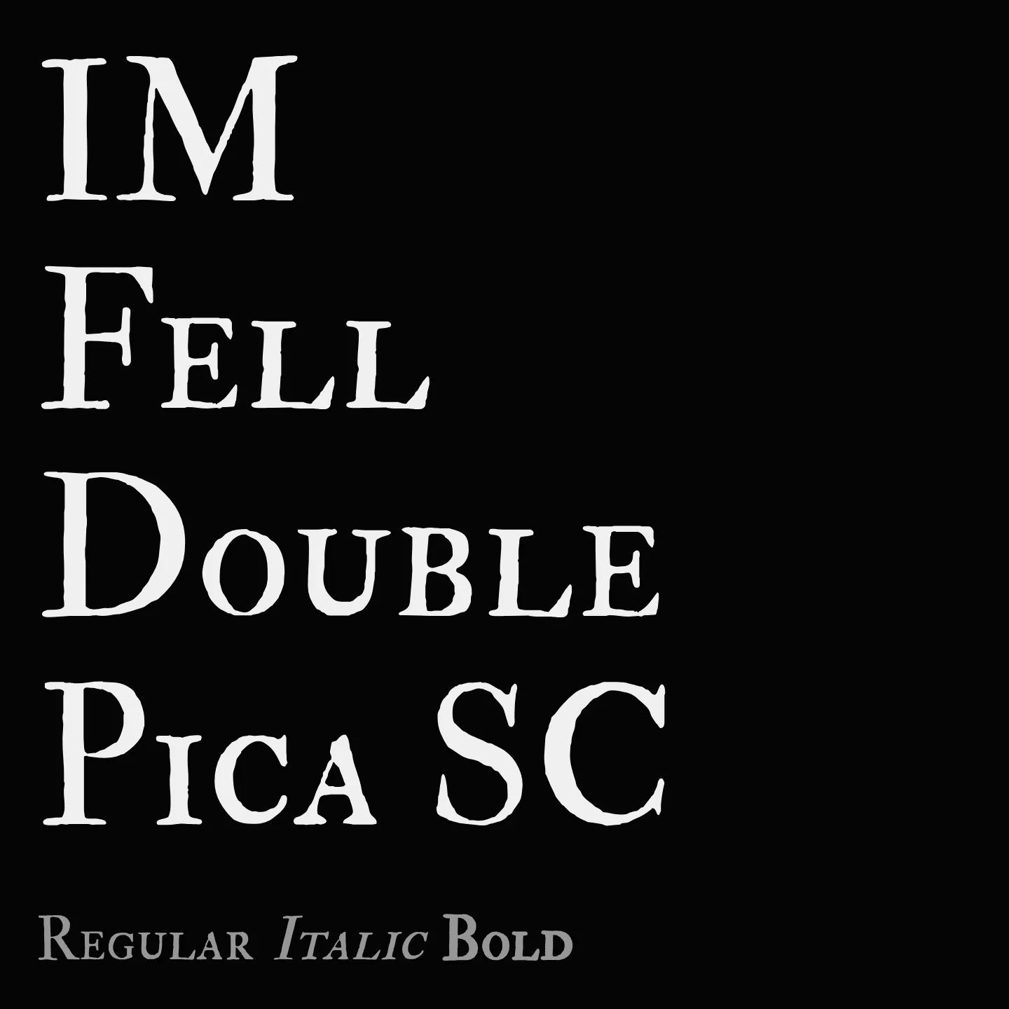
IM Fell Double Pica SC revives the style of types used at the Oxford Printing House in the late 1600s, reflecting the legacy of John Fell and the craftsmanship of Peter De Walpergen. It features a single weight and normal style, supporting Latin scripts, and is designed for display use with its small caps formality and historic character.
Overview
IM Fell Double Pica SC is a serif font family that draws from the oldest surviving punches and matrices used in England, originally developed under the direction of John Fell, Bishop of Oxford, in the 17th century. The typeface embodies the aesthetic of Oxford's learned press, combining historical authenticity with contemporary digital usability. It is a single-weight, normal-style font suitable for display and titling purposes, capturing the spirit of early modern English typography.
Designer: Igino Marini
Similar fonts:
- IM Fell Great Primer SC
- IM Fell French Canon SC
- IM Fell English SC
Usage
"" Access one-stop/im-fell-double-pica-sc using the OneStop MCP.If you do not have the OneStop MCP, read the MCP setup docs.