Media
About
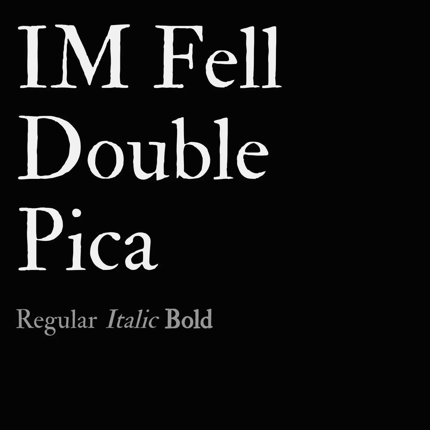
IM Fell Double Pica revives the style of types used at the Oxford University Press in the late 1600s, originally developed under Bishop John Fell's direction. It reflects the craftsmanship of early English printing with a robust serif design available in both roman and italic styles. This single-weight family supports Latin scripts and is well suited for text that seeks a classical and scholarly tone.
Overview
IM Fell Double Pica is a serif typeface family designed by Igino Marini, based on the historic Fell Types used by the Oxford University Press since the 17th century. It captures the essence of early English printing with its distinctive, somewhat rustic serif forms and includes both normal and italic styles at a single weight. The design is rooted in the punches and matrices preserved from that era, offering a typographic voice that is both authentic and scholarly. It supports Latin scripts and is ideal for projects that require a historic or academic atmosphere.
Designer: Igino Marini
Similar fonts:
- IM Fell Great Primer
- IM Fell DW Pica
- IM Fell French Canon
Usage
"" Access one-stop/im-fell-double-pica using the OneStop MCP.If you do not have the OneStop MCP, read the MCP setup docs.