Media
About
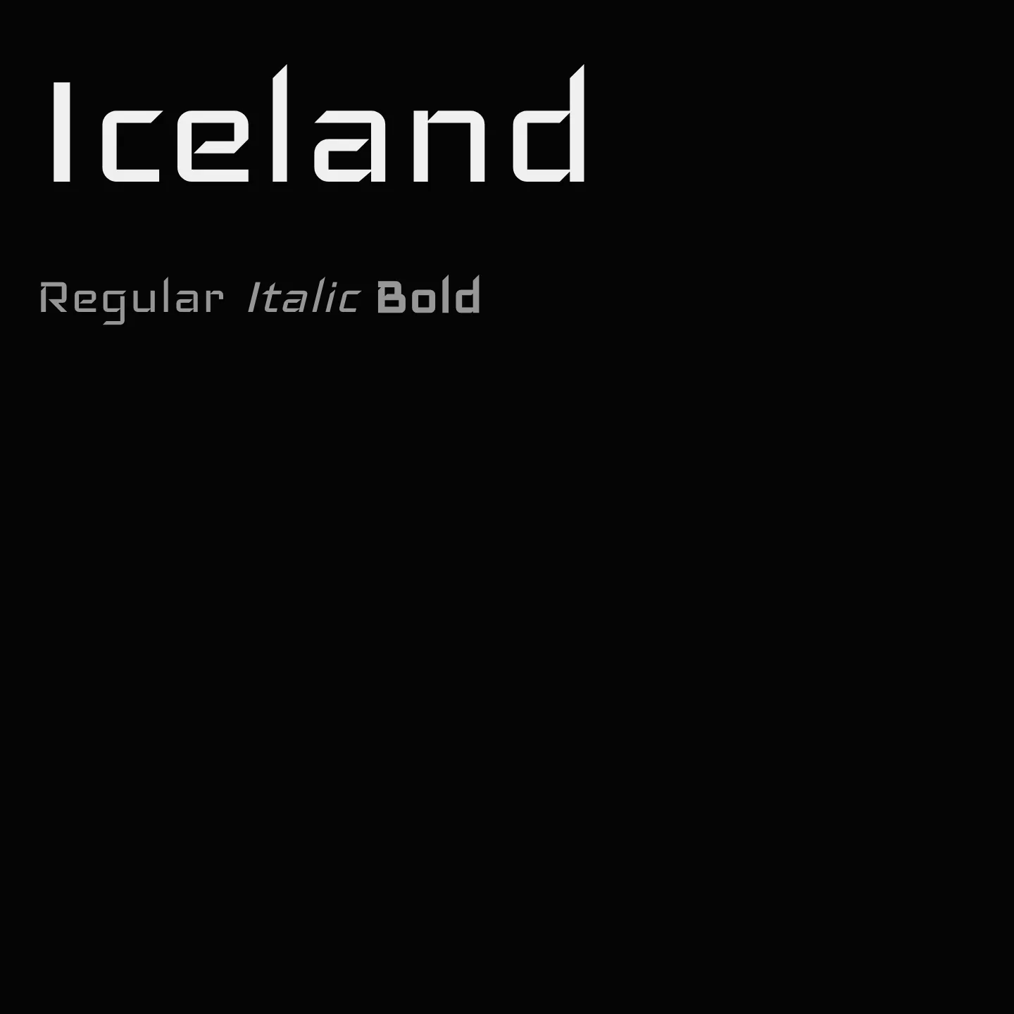
Iceland is a geometric display typeface inspired by 1950s machinery and technology aesthetics, featuring vertical strokes and 45° diagonal cuts with rounded outlines. It has wide proportions, a generous x-height, and simplified letterforms to enhance readability at small sizes, while offering a crisp impression at larger sizes. Uppercase letters are heavier than lowercase, allowing for small caps usage and easy distinction. Its modular, squarish design integrates well into grids and logotypes.
Overview
Iceland is a display font designed with a modular, square-shaped structure that evokes the machinery and interior design style of the 1950s. It emphasizes vertical strokes and 45° diagonal cuts with rounded outlines to maintain clarity on screens, especially at low resolutions. The typeface features wide proportions and a large x-height to improve legibility, with simplified letterforms such as k, f, and r that aid readability at small sizes and provide a sharp, crisp look at display sizes. The uppercase letters are notably heavier than the lowercase, facilitating distinction and enabling their use as small caps. Its ascetic, modular character and squarish proportions make it suitable for integration into modular grids and logotypes.
Designer: Victor Kharyk
Similar fonts:
- Aldrich
- Electrolize
Usage
"" Access one-stop/iceland using the OneStop MCP.If you do not have the OneStop MCP, read the MCP setup docs.