Media
About
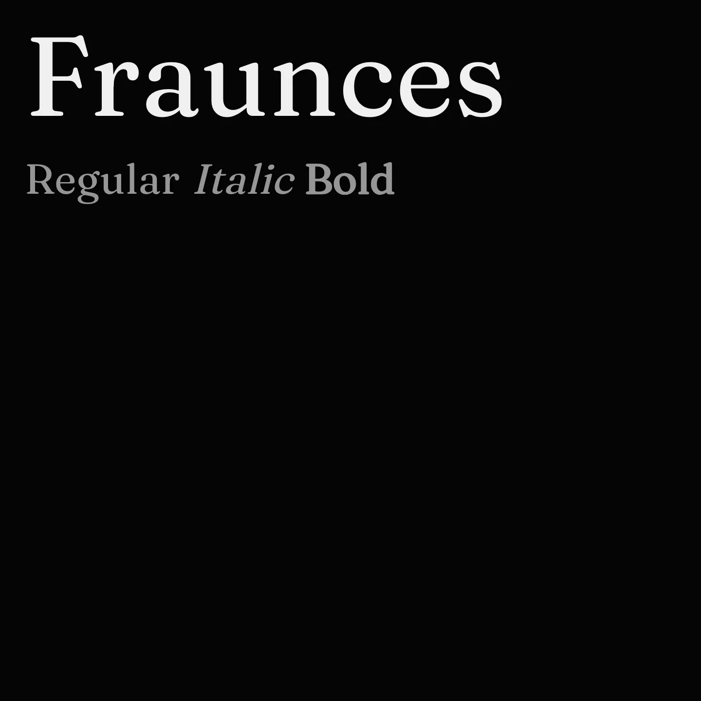
Fraunces is a display serif inspired by early 20th-century typefaces like Windsor and Souvenir. It features variable axes for weight, optical size, softness, and a unique 'wonky' style that adds playful character to select glyphs. Designed for expressive headlines and editorial use, Fraunces balances elegance with a workhorse versatility.
Overview
Fraunces is a variable Old Style soft-serif typeface designed for display purposes, drawing inspiration from early 20th-century designs such as Windsor, Souvenir, and the Cooper series. It includes four variable axes: Weight, Optical Size, Softness, and Wonky, the latter two controlling inkiness and playful character substitutions respectively. This makes Fraunces suitable for expressive and elegant headlines as well as editorial and portfolio designs. Its extensive weight range and stylistic flexibility allow it to adapt to various design contexts while maintaining a distinctive personality. Designers looking for a typeface that combines historical charm with modern variability will find Fraunces a compelling choice.
Designers: Undercase Type, Phaedra Charles, Flavia Zimbardi
Complementary fonts:
- Use Fraunces for display with Space Grotesk or Poppins for supporting text.
- Use Playfair Display for headlines with Fraunces for body text.
Usage
"" Access one-stop/fraunces using the OneStop MCP.If you do not have the OneStop MCP, read the MCP setup docs.