Media
About
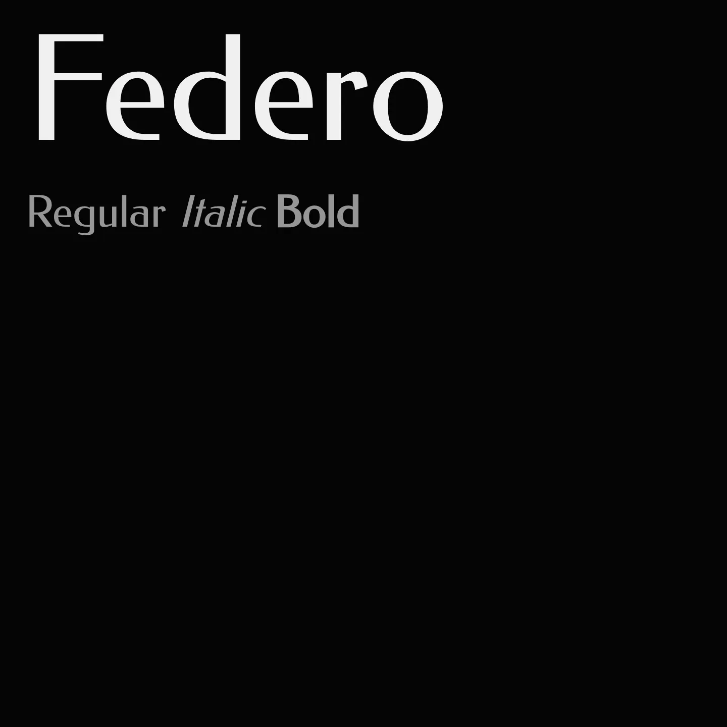
Federo is a single-weight sans-serif display font designed to closely follow Jakob Erbar's 1909 Feder Grotesk. It features slightly reduced contrast and increased counters for improved legibility on screens. Its design is tailored for crisp, consistent web use, making it suitable for headlines and display text.
Overview
Federo is a display webfont that references Jakob Erbar's Feder Grotesk. The goal was to keep the typeface as close as possible to the original 1909 design while adapting it for crisp web typography. Details were refined and contrast was slightly reduced for consistency. Figures obtained regular proportions and counters were increased for better legibility. Designed by Olexa Volochay in 2011.
Designer: Olexa Volochay
Usage
"" Access one-stop/federo using the OneStop MCP.If you do not have the OneStop MCP, read the MCP setup docs.