Media
About
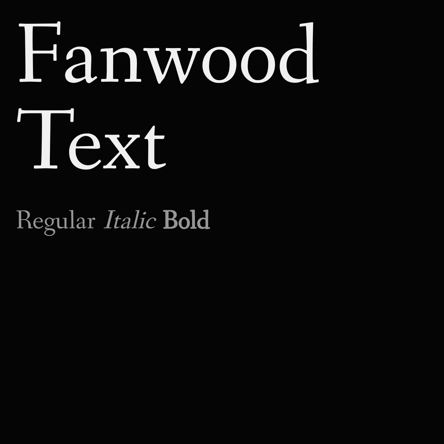
Fanwood Text revives the Fairfield typeface originally designed by Rudolph Ruzicka in 1940, featuring a slightly darker and lower contrast style optimized for digital reading. It is well-suited for editorial layouts, brand systems, and print work where clarity and authority are important. The family includes regular and italic styles in a single weight.
Overview
Fanwood Text is a serif font family designed by Barry Schwartz as a revival of Rudolph Ruzicka's Fairfield. It offers a refined, darker roman and italic style with reduced contrast to enhance readability, especially on digital devices. This makes it ideal for long-form reading and editorial use, as well as print projects requiring a crafted and authoritative tone.
Designer: Barry Schwartz
Complementary fonts:
- Use Fanwood Text for display with Maven Pro for supporting text.
- Use Quattrocento or Shrikhand for headlines with Fanwood Text for body text.
Similar fonts:
- Linden Hill
- Mate
- Cormorant Garamond
Usage
"" Access one-stop/fanwood-text using the OneStop MCP.If you do not have the OneStop MCP, read the MCP setup docs.