Media
About
Familjen Grotesk features large ink traps that enhance clarity at small sizes and add distinctive style to headlines. Its large x-height, closed apertures, and sturdy uppercase letters align it with the grotesque sans serif tradition, making it suitable for a wide range of typographic applications.
Overview
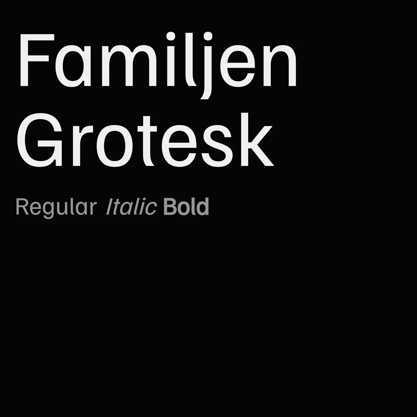
Familjen Grotesk is a sans serif typeface with a contemporary appearance intended for both text and display. Large notches known as "ink traps" add style to headlines and clarity to small size text. The large x-height, closed apertures and sturdy upper-case letters relate to the grotesque subgenre of sans serifs.
Designer: Familjen STHLM AB
Usage
"" Access one-stop/familjen-grotesk using the OneStop MCP.If you do not have the OneStop MCP, read the MCP setup docs.