Media
About
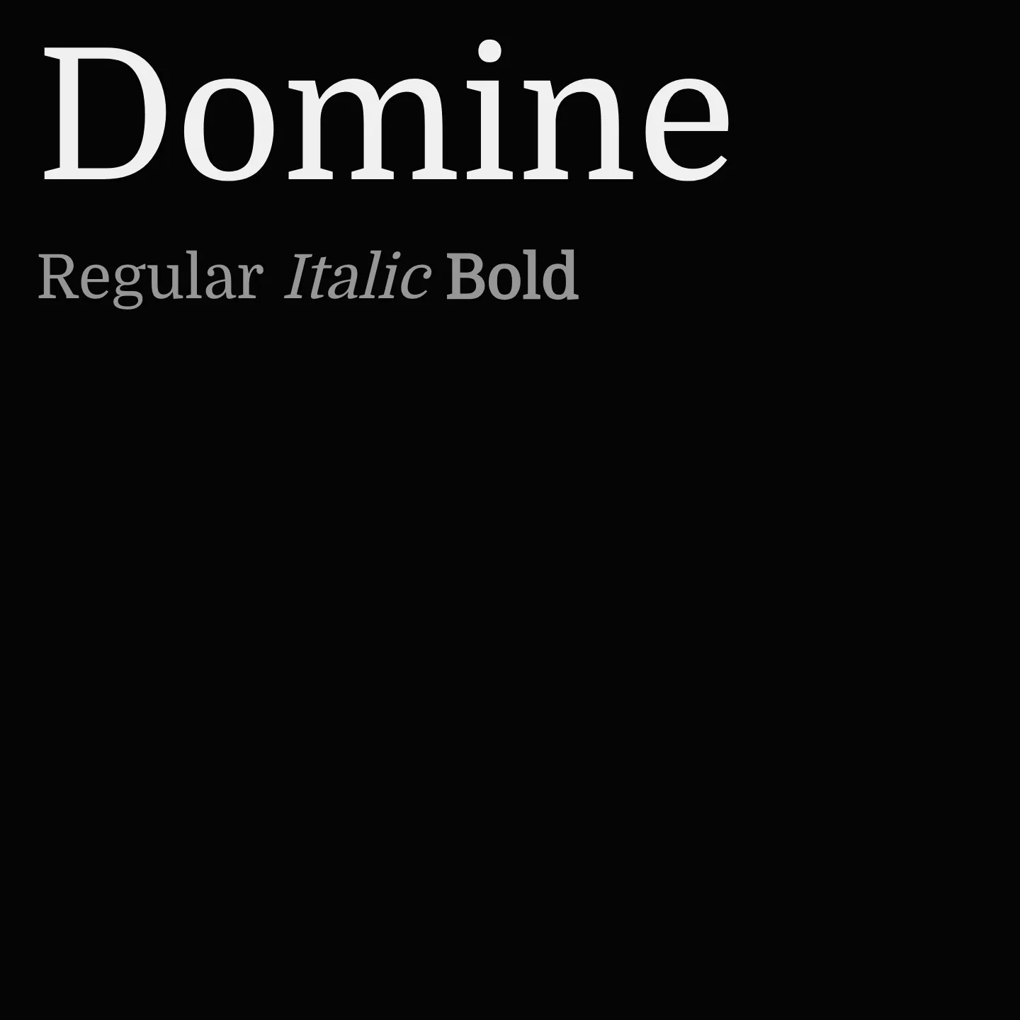
Domine is a variable serif font family designed for readability in long-form digital text, such as newspapers and magazines. It features slightly shortened serifs and open counters for improved rendering at small sizes, with a friendly and contemporary appearance influenced by classic typefaces like Clarendon and Cheltenham. Domine performs well at pixel sizes 11 to 16, making it ideal for web body copy.
Overview
Domine was crafted with a focus on web readability, combining traditional serif elements with modern design tweaks to enhance legibility and comfort during extended reading. Its rounded but slightly squared letterforms open counters for better on-screen clarity, while shorter serifs and deep joins prevent dark spots in text. The spacing is optimized for digital environments, offering more air between letters than typical print fonts. These features make Domine a strong choice for editorial websites and digital publications where text clarity is paramount.
Designer: Impallari Type
Complementary fonts:
- Use Domine for display with Nunito Sans, Open Sans, or Work Sans for supporting text.
Similar fonts:
- Brawler
- Rasa
- Yrsa
Usage
"" Access one-stop/domine using the OneStop MCP.If you do not have the OneStop MCP, read the MCP setup docs.