Media
About
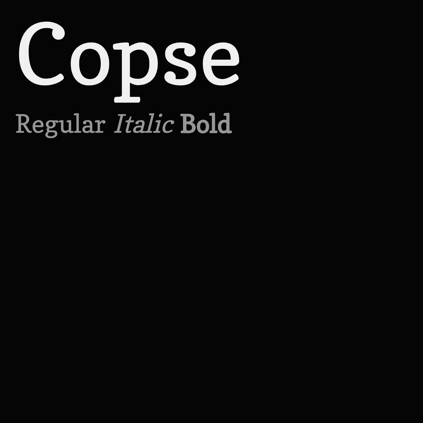
Copse is a serif typeface characterized by its low contrast and slab serif style, featuring gently softened edges that maintain a clear and stable posture. It is designed primarily for Latin script and is available in a regular weight and normal style, making it suitable for text that requires readability with a subtle personality.
Overview
Copse is a low-contrast slab serif that is a little soft around the edges, but with a clear and sturdy posture. It supports Latin script and comes in a single regular weight and normal style, making it a reliable choice for text settings where a subtle slab serif presence is desired. Its design balances softness with structural clarity, providing a distinctive yet approachable typographic voice.
Designer: Dan Rhatigan
Similar fonts:
- Neuton
- Enriqueta
- Inika
Usage
"" Access one-stop/copse using the OneStop MCP.If you do not have the OneStop MCP, read the MCP setup docs.