Media
About
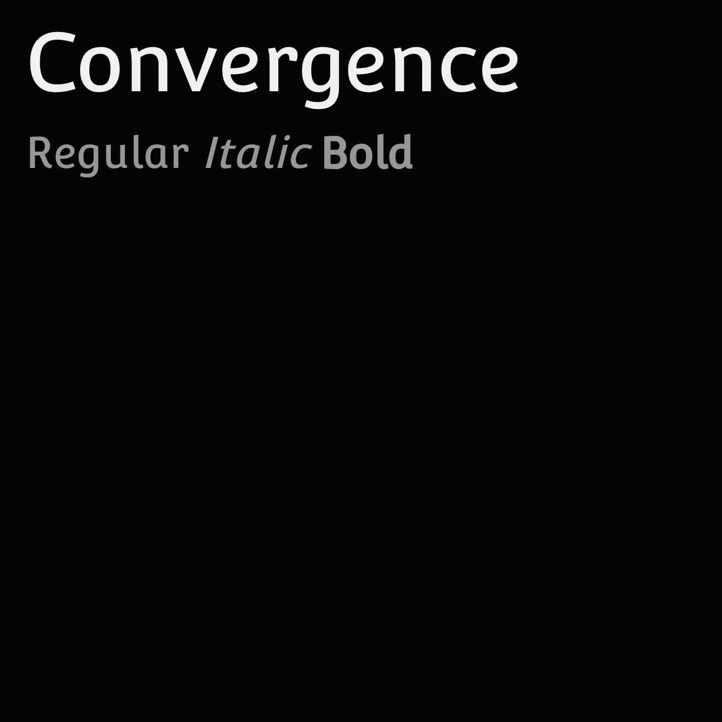
Convergence is a sans serif typeface characterized by its low contrast and upright italic style, featuring a large x-height that enhances readability. Its design uniquely blends upright and italic elements, with bottom halves of glyphs showing transitive serifs and upper halves retaining sans serif terminals. Notable glyphs such as a, g, e, and r exhibit italic structures and closed instrokes, reflecting influences from humanistic cursive manuscripts.
Overview
Convergence is a low contrast Upright Italic Sans Serif Typeface with a large x-height. It was created by two designers with very different ideas, who took advantage of their divergent criteria to draw glyphs that made the Upright and Italic styles converge without mixing them. In this way, it was possible to converge the inclination of an Upright Sans Serif with a Sans Serif Italic. Looking at the font in detail, the bottom halves of the glyphs have Transitive serifs while the upper halves conserve the Sans Serif terminals. Other specific details can be seen in the a, g, and e glyphs, which have an Italic structure, not an Upright one. In addition, the glyph for the letter r has a relatively closed instroke. The references used to develop this font were Bree from TypeTogether, Parisine de Porchez Typofonderie, and, undeniably, Ludovico Degli Arrighi's manuscript about the structure the "humanistic cursive" that is Convergence.
Designers: Nicolás Silva, John Vargas Beltrán
Similar fonts:
- Voces
- Inder
Usage
"" Access one-stop/convergence using the OneStop MCP.If you do not have the OneStop MCP, read the MCP setup docs.