Media
About
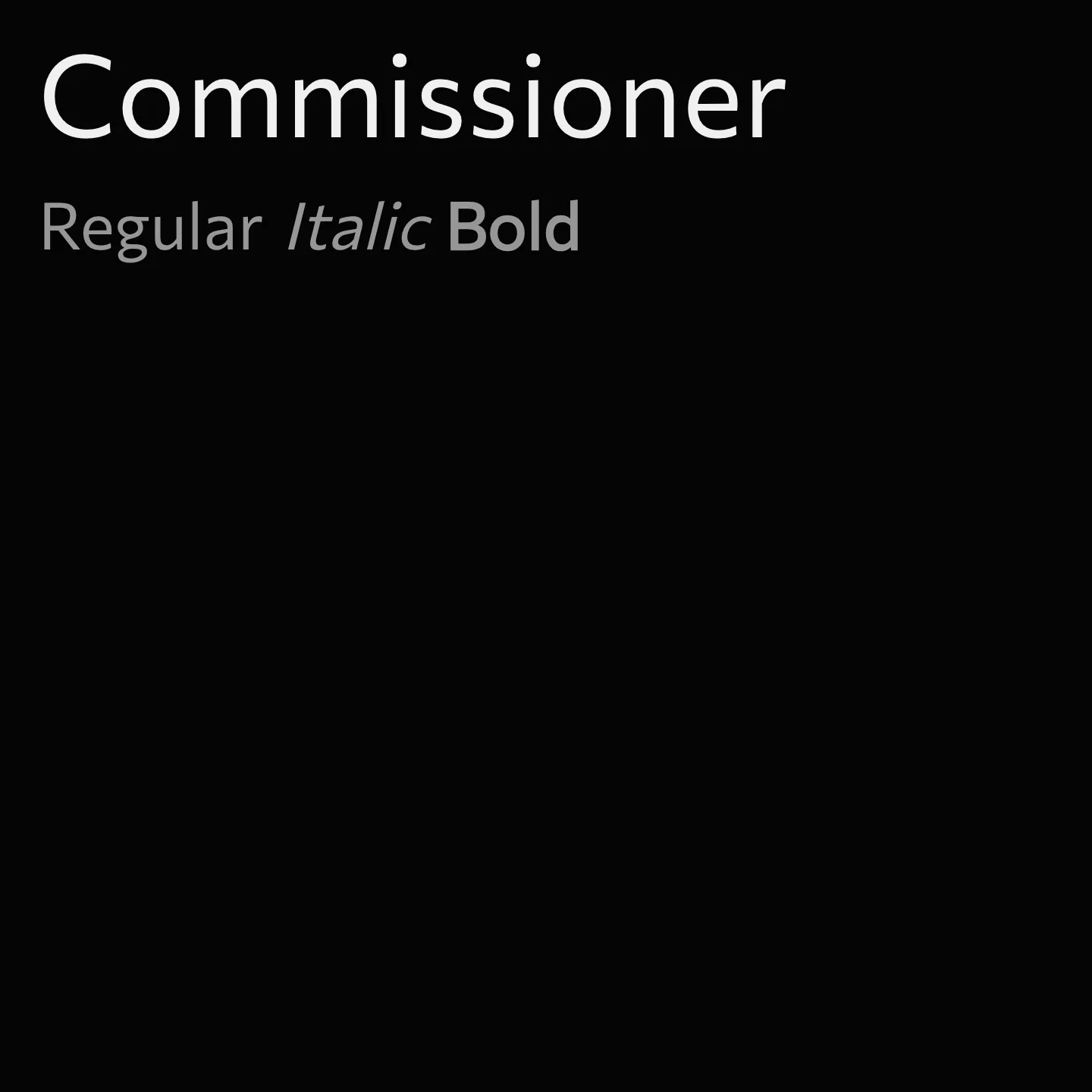
Commissioner is a low-contrast humanist sans-serif font family featuring almost classical proportions and designed as a variable family. It offers three stylistic voices that range from a straightforward grotesque to more expressive glyphic and wedge-like serifs. The family spans weights from Thin to Black, including italics, and balances warmth and appeal across text sizes with diverse lowercase and capital proportions.
Overview
Commissioner is a low-contrast humanist sans-serif with almost classical proportions, conceived as a variable family. The family consists of three “voices”. The default style is a grotesque with straight stems. As the flair axis grows the straight grotesque terminals develop a swelling and become almost glyphic serifs and the joints become more idiosyncratic. The volume axis transforms the glyphic serifs to wedge-like ones. Each voice of Commissioner comes in a range of styles from Thin to Black including italics. The diverse proportions of lowercase and capitals add warmth and appeal to texts across sizes, while the different voices can express a variation in the typographic texture that ranges from delicate in text sizes to exuberant in larger sizes.
Designer: Kostas Bartsokas
Usage
"" Access one-stop/commissioner using the OneStop MCP.If you do not have the OneStop MCP, read the MCP setup docs.