Media
About
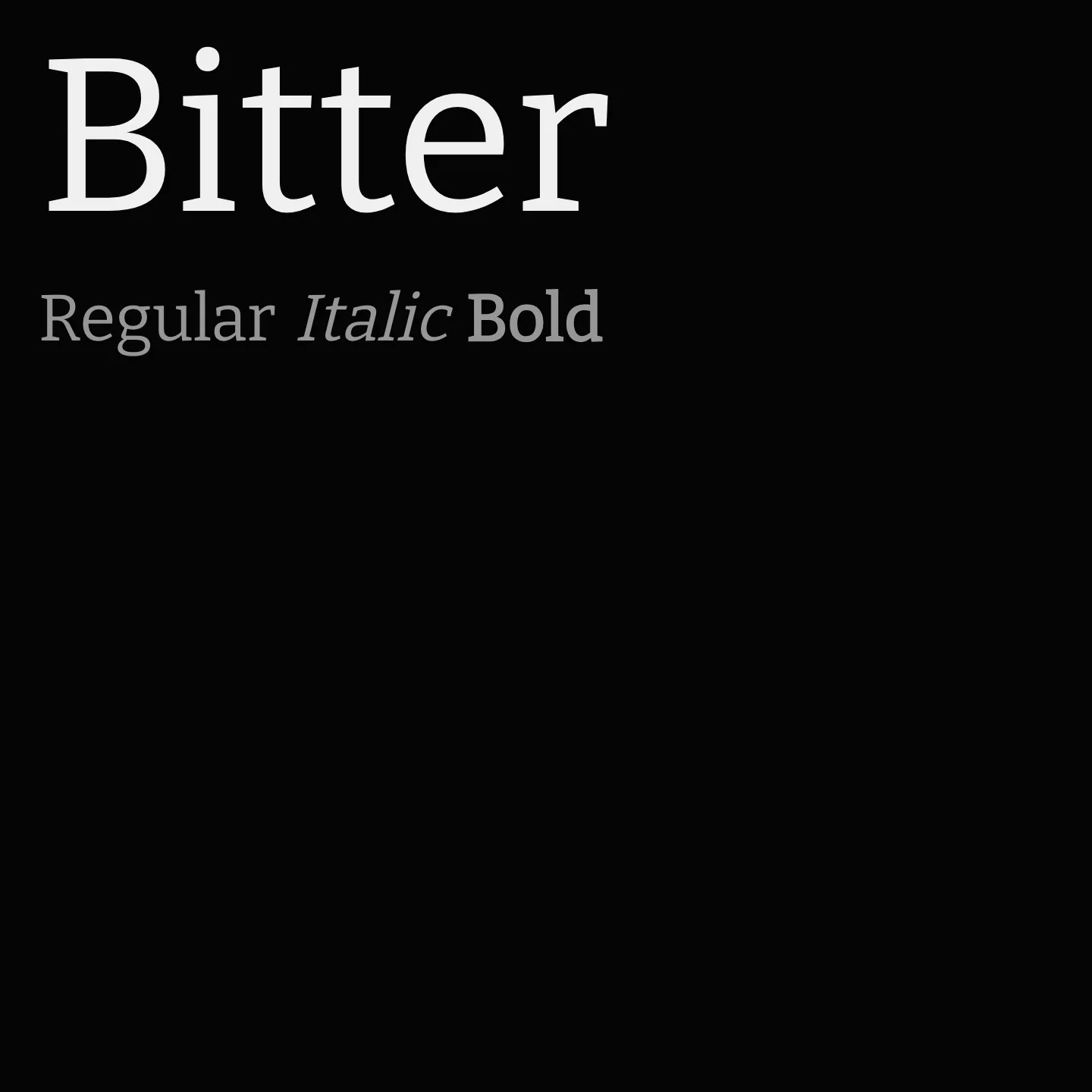
Designed by Sol Matas, Bitter is a slab serif font family crafted for digital text environments, featuring large x-heights and consistent stroke weights that enhance legibility on screens. Its design balances humanistic readability with a rhythmic flow, making it suitable for extended reading on various devices. Bitter includes a wide range of weights and styles, supporting multiple scripts.
Overview
Bitter is a contemporary slab serif typeface designed specifically for comfortable reading on screens. It features large x-heights and minimal stroke weight variation, with a thicker-than-usual Regular style to create a strong text color in paragraphs. The serifs are as thick as the strokes and have square terminals, contributing to its robust appearance. Each glyph is carefully crafted with smooth curves, initially designed on a pixel grid for clarity and precision. The typeface is manually spaced to minimize kerning needs, enhancing its usability in digital text settings.
Designer: Sol Matas
Complementary fonts:
- Use Bitter for display with Raleway for supporting text.
- Use Work Sans for headlines with Bitter for body text.
Similar fonts:
- Kadwa
- Sura
- Inika
Usage
"" Access one-stop/bitter using the OneStop MCP.If you do not have the OneStop MCP, read the MCP setup docs.