Media
About
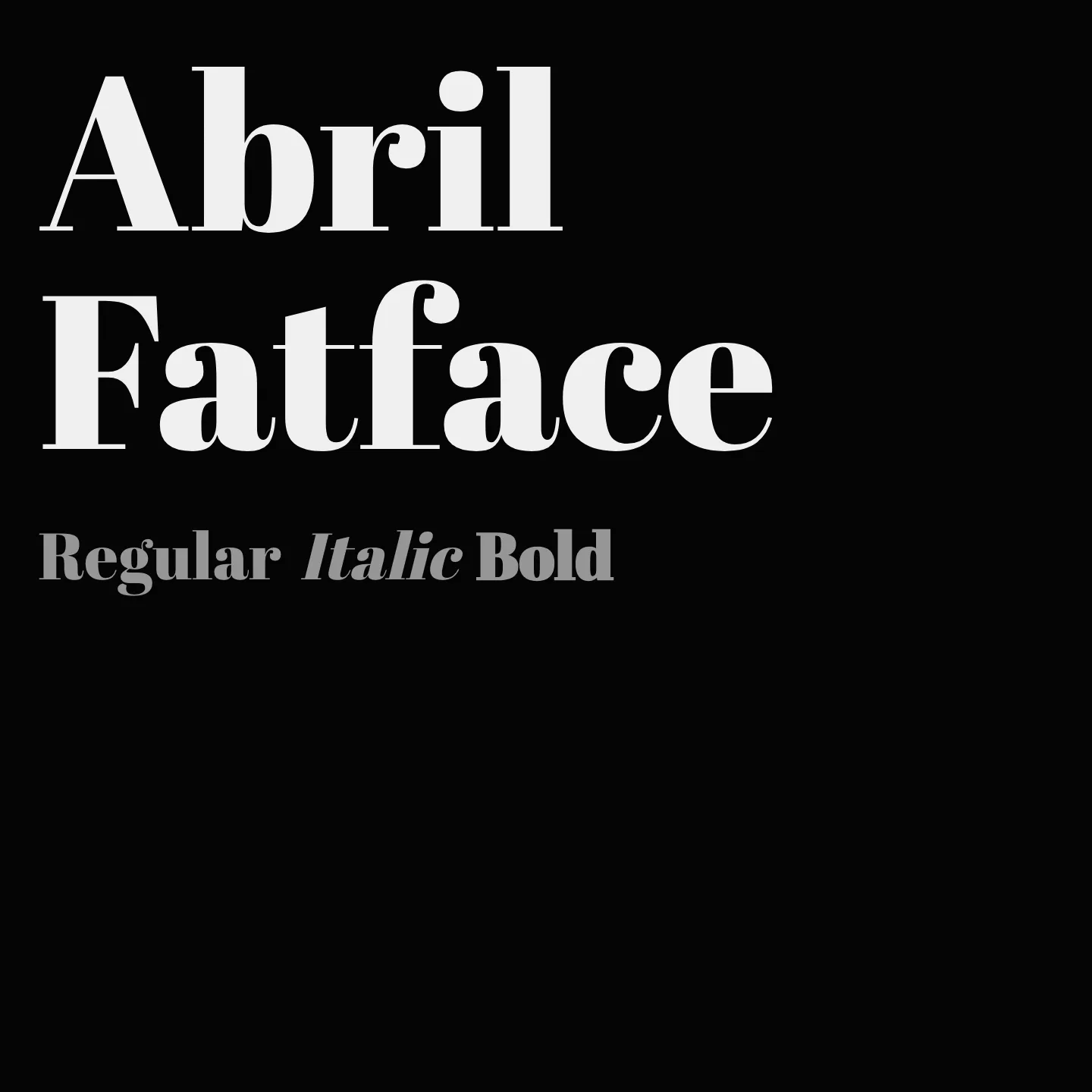
Abril Fatface is a display serif typeface designed by Veronika Burian and José Scaglione of TypeTogether. It features thin serifs and clean curves that provide a refined and elegant appearance, ideal for titling and headlines. The font supports an extended Latin character set covering over 50 languages, making it versatile for diverse typographic needs.
Overview
Abril Fatface is part of the Abril type family, which includes 18 styles for both display and text uses. This particular style is a contemporary revamp of classic Didone titling fonts, balancing neutrality with strong presence through its measured tension and high contrast. Its design draws inspiration from heavy titling fonts used in 19th-century British and French advertising posters, lending any headline an elegant and refined touch. The extended Latin character set supports numerous Central and Northern European languages, enhancing its usability in multilingual contexts.
Designers: Veronika Burian, José Scaglione
Complementary fonts:
- Use Abril Fatface for display with Poppins or Lato for supporting text.
Similar fonts:
- Vidaloka
- Rakkas
Usage
"" Access one-stop/abril-fatface using the OneStop MCP.If you do not have the OneStop MCP, read the MCP setup docs.