Media
About
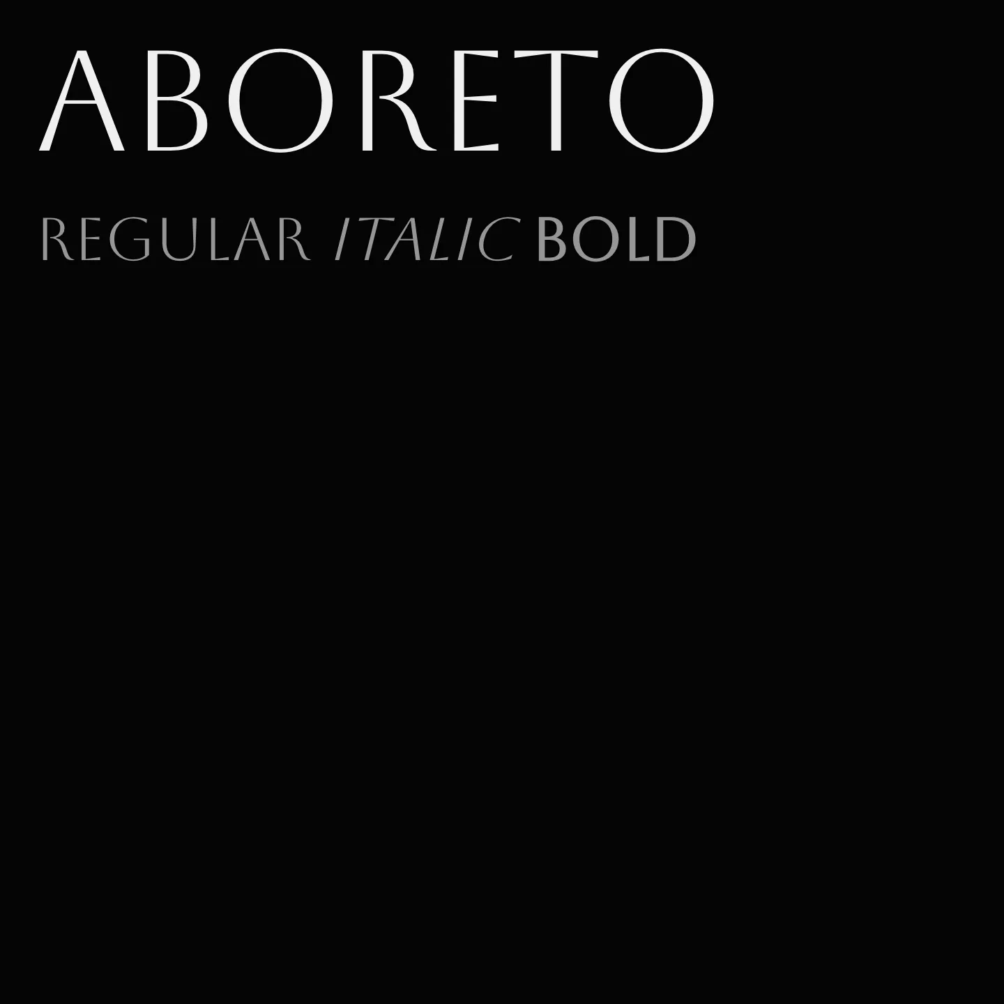
Aboreto draws inspiration from the 15th-century Florentine sculptor Luca della Robbia's early Renaissance majuscule alphabet. It is a revival that balances historical form with contemporary needs, featuring vertical stress and subtle serif hints through stroke tapering or thickened endings. Offered in a single high-contrast, thin weight, Aboreto suits display use where elegance and clarity are desired.
Overview
Aboreto is a display typeface based on early Renaissance majuscule alphabets created by Luca della Robbia, a 15th-century Florentine sculptor. Rather than a direct digital reproduction, it is a revival that adapts historical letterforms to modern requirements and technologies. The typeface exhibits vertical stress, uncommon in its historical period but typical of later designs. Its construction is essentially sans-serif, with occasional subtle serif indications achieved through stroke tapering or slightly thickened stroke ends. Aboreto is available in one weight: a high-contrast regular that leans towards the thinner side, making it suitable for elegant display typography.
Designer: Dominik Jáger
Usage
"" Access one-stop/aboreto using the OneStop MCP.If you do not have the OneStop MCP, read the MCP setup docs.