Popular open fonts
A collection of the most popular open fonts.
11 results
A collection of the most popular open fonts.
11 results
11 listings
11 listings
Cost
Free
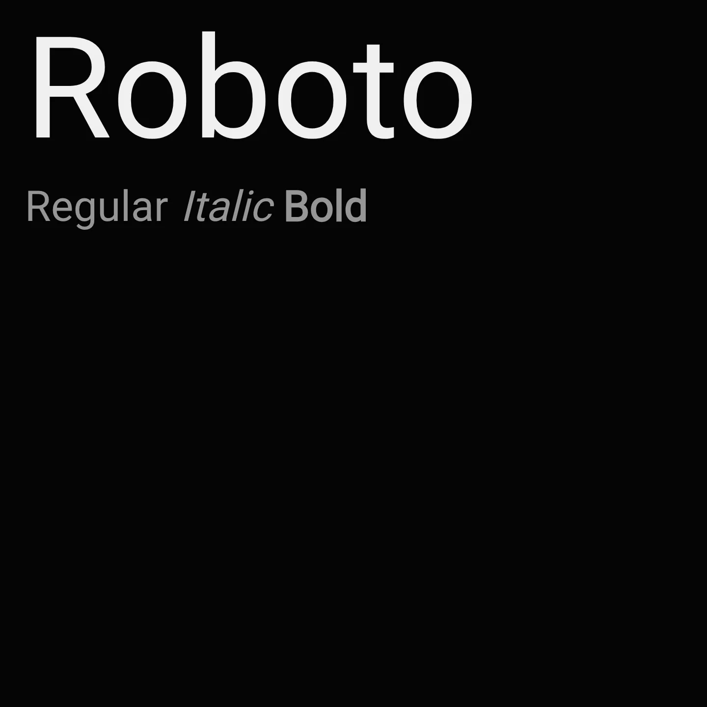
Roboto features a mechanical skeleton with largely geometric forms balanced by open curves, allowing letters to maintain natural widths and a comfortable reading rhythm. It supports multiple weights and styles, including variable font axes for weight and width, making it suitable for diverse design contexts from body text to display.
Cost
Free
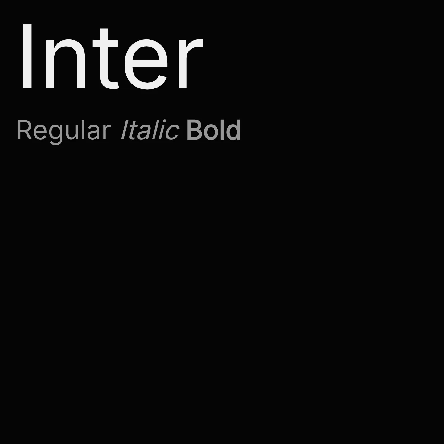
Inter is a variable font family designed specifically for computer screens, featuring a tall x-height to improve readability of mixed-case and lowercase text. It includes OpenType features such as contextual alternates, slashed zero, and tabular numbers to enhance clarity and typographic flexibility. The family supports multiple weights and styles, making it suitable for diverse digital typography needs.
Cost
Free
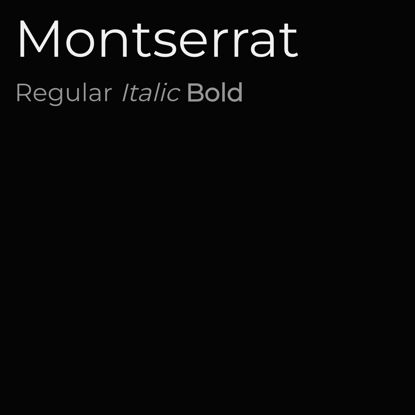
Inspired by the old posters and signs of Buenos Aires' Montserrat neighborhood, this geometric sans-serif family captures the spirit of early 20th-century urban typography. It features a wide range of weights from thin to black and supports multiple scripts including Latin, Cyrillic, and Vietnamese. Montserrat is suitable for both display and text use, with refined letterforms optimized for readability and aesthetic appeal.
Cost
Free
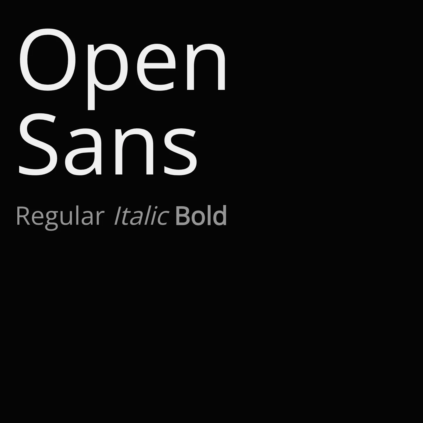
Open Sans features upright stress and open forms, delivering a neutral yet friendly appearance. It supports a broad character set including Latin, Greek, Cyrillic, and Hebrew scripts. Updated as a variable font, it excels in readability and versatility for diverse digital and print applications.
Cost
Free
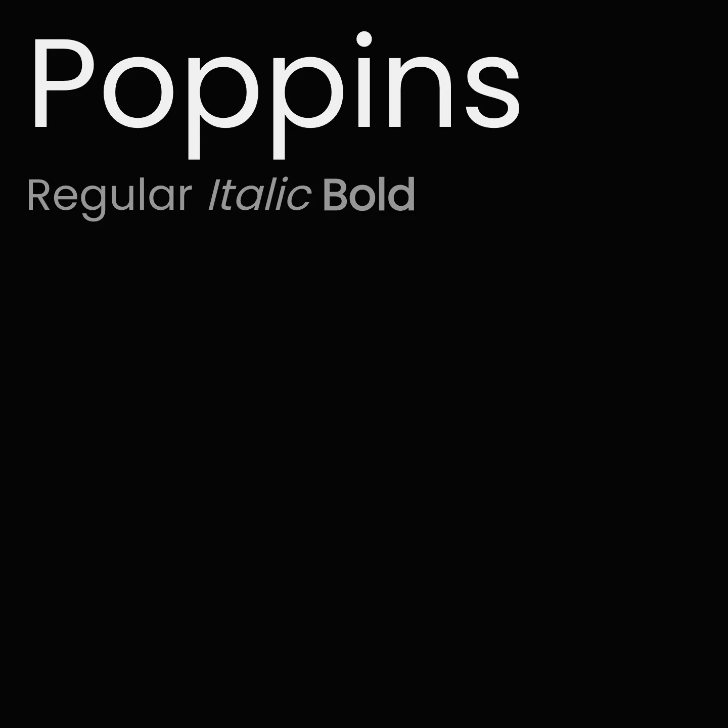
Poppins is a geometric sans-serif font family designed by Indian Type Foundry, featuring support for both Latin and Devanagari scripts. It is characterized by nearly monolinear letterforms based on circles, with optical corrections for balanced typographic color. The family includes multiple weights from thin to black and both italic and normal styles, making it versatile for various design needs.
Cost
Free
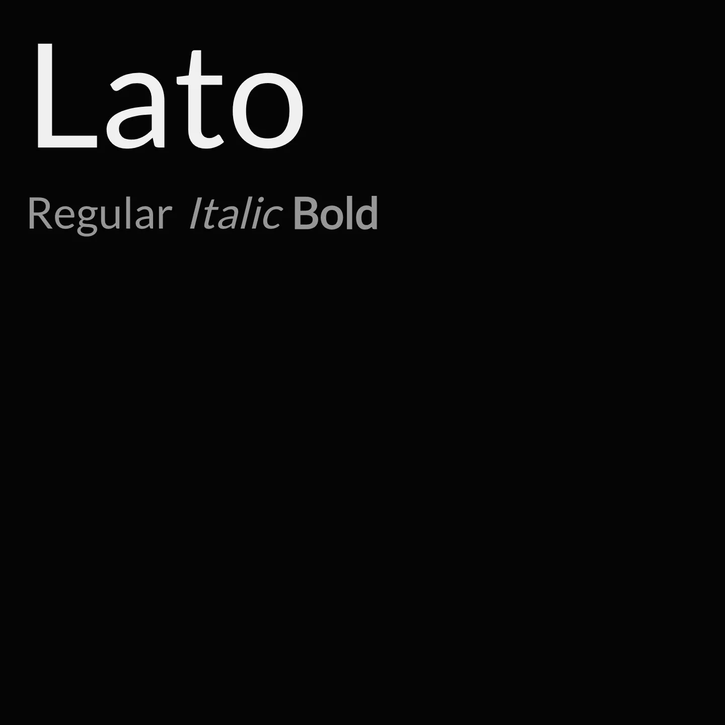
Lato is a sans-serif typeface family created by Łukasz Dziedzic in 2010, characterized by classical proportions and a sleek, contemporary feel. It balances transparency in body text with distinctive traits at larger sizes, featuring semi-rounded details that convey warmth alongside structural stability. The design aims to be serious yet friendly, embodying the spirit of summer.
Cost
Free
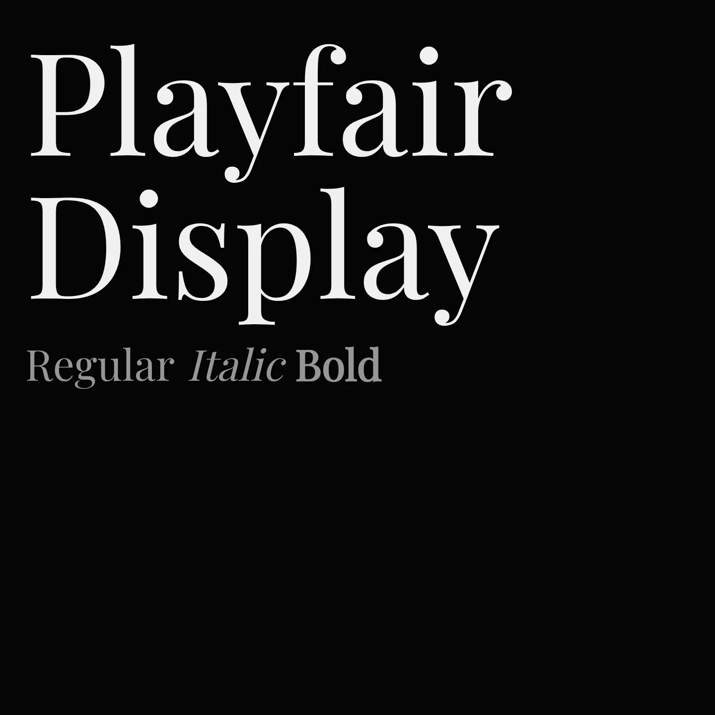
Playfair Display is a transitional serif font inspired by late 18th-century European Enlightenment typography, featuring high contrast and delicate hairlines. It is suited for large-size display settings and pairs well with classic serif and modern sans-serif fonts for body text. The family includes multiple weights and styles, supporting Latin and Cyrillic scripts.
Cost
Free
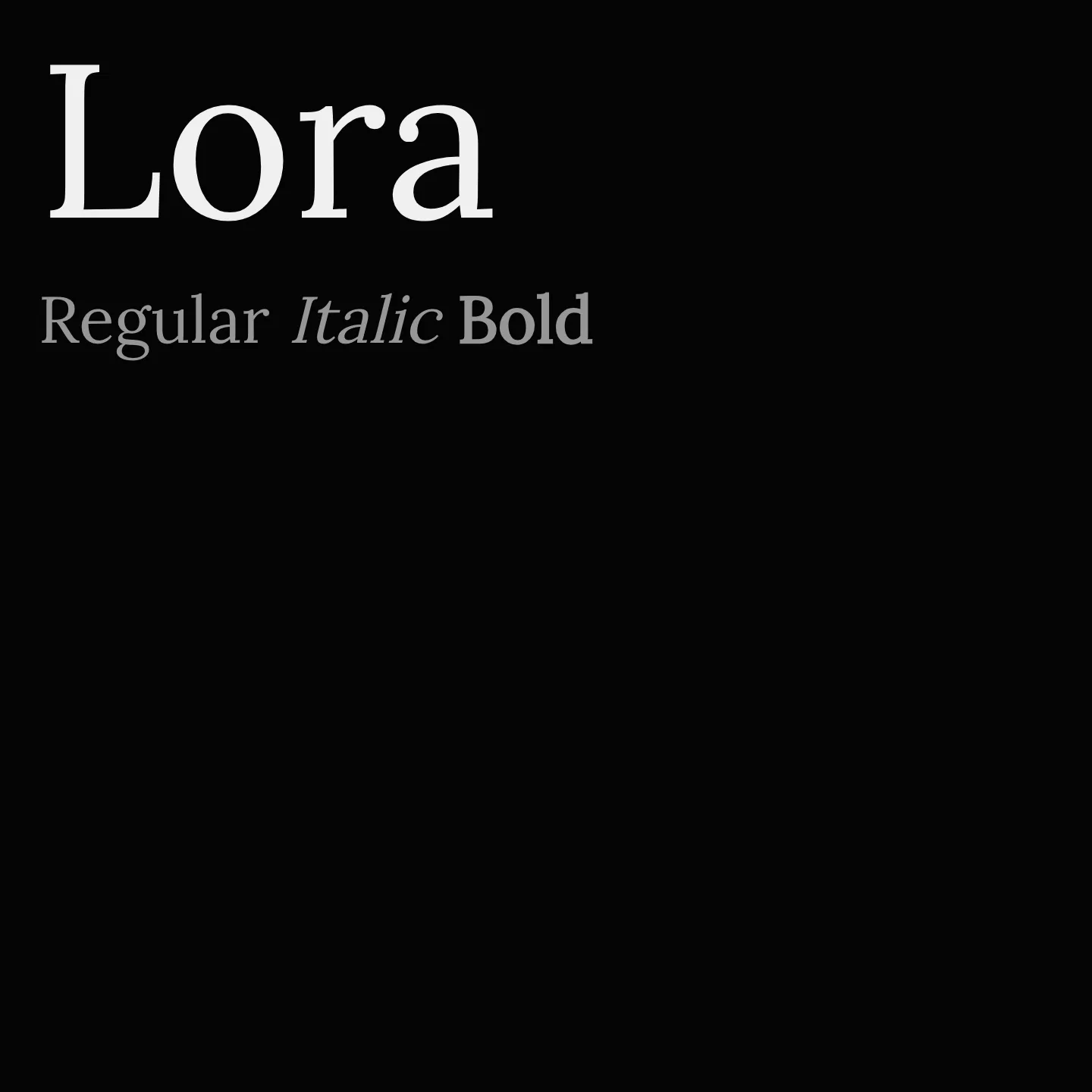
Lora is a well-balanced serif typeface featuring moderate contrast and brushed curves that create a distinctive yet readable text appearance. Optimized for both screen and print, it suits modern storytelling and art essays. The family includes variable font support and multiple weights with italic styles, enhancing versatility for various typographic needs.
Cost
Free
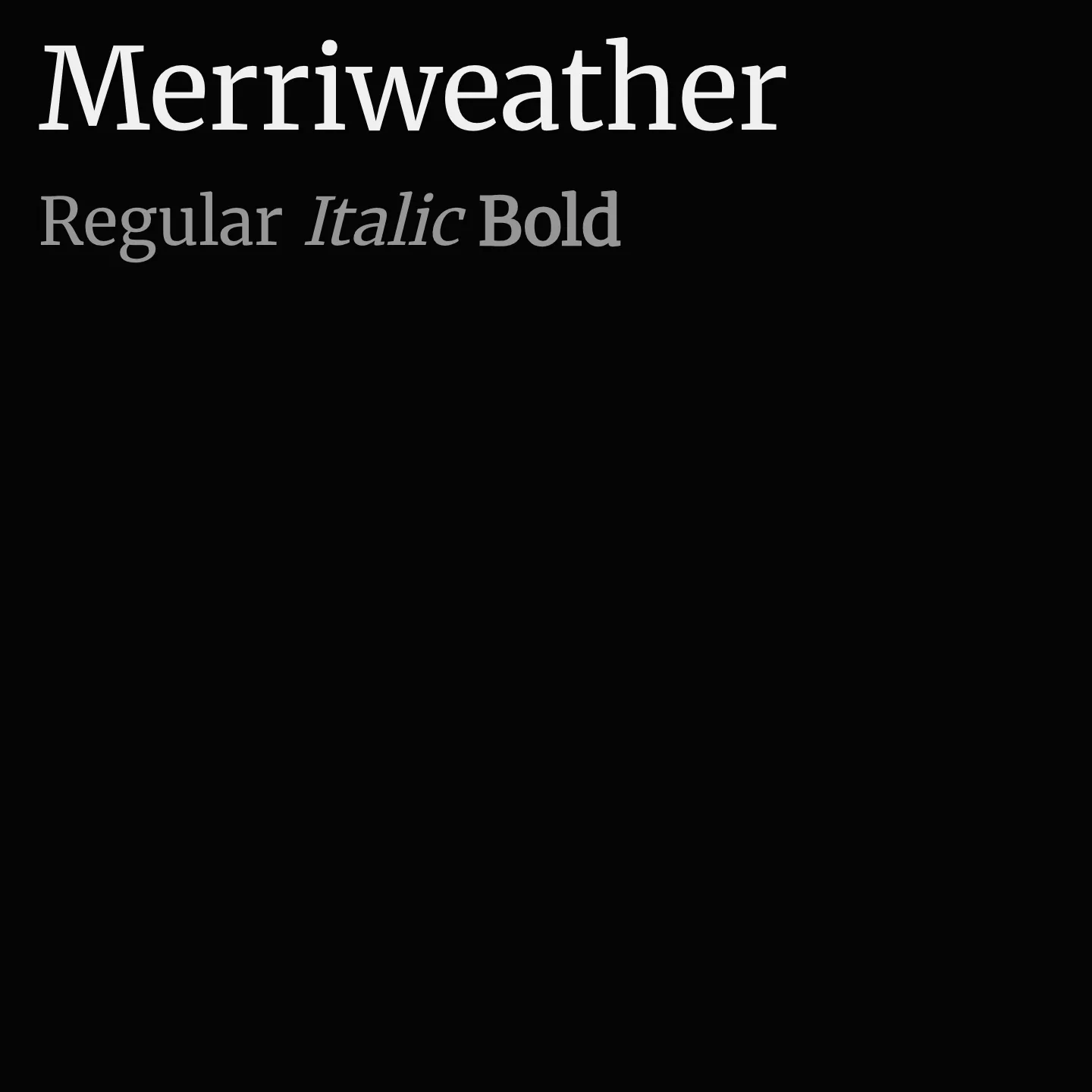
Merriweather is a serif font family crafted to enhance readability on digital screens. It features slightly condensed letterforms, mild diagonal stress, open forms, and a very large x-height, making it suitable for extended text. The family includes multiple weights and styles, including variable font axes for optical size, width, and weight.
Cost
Free
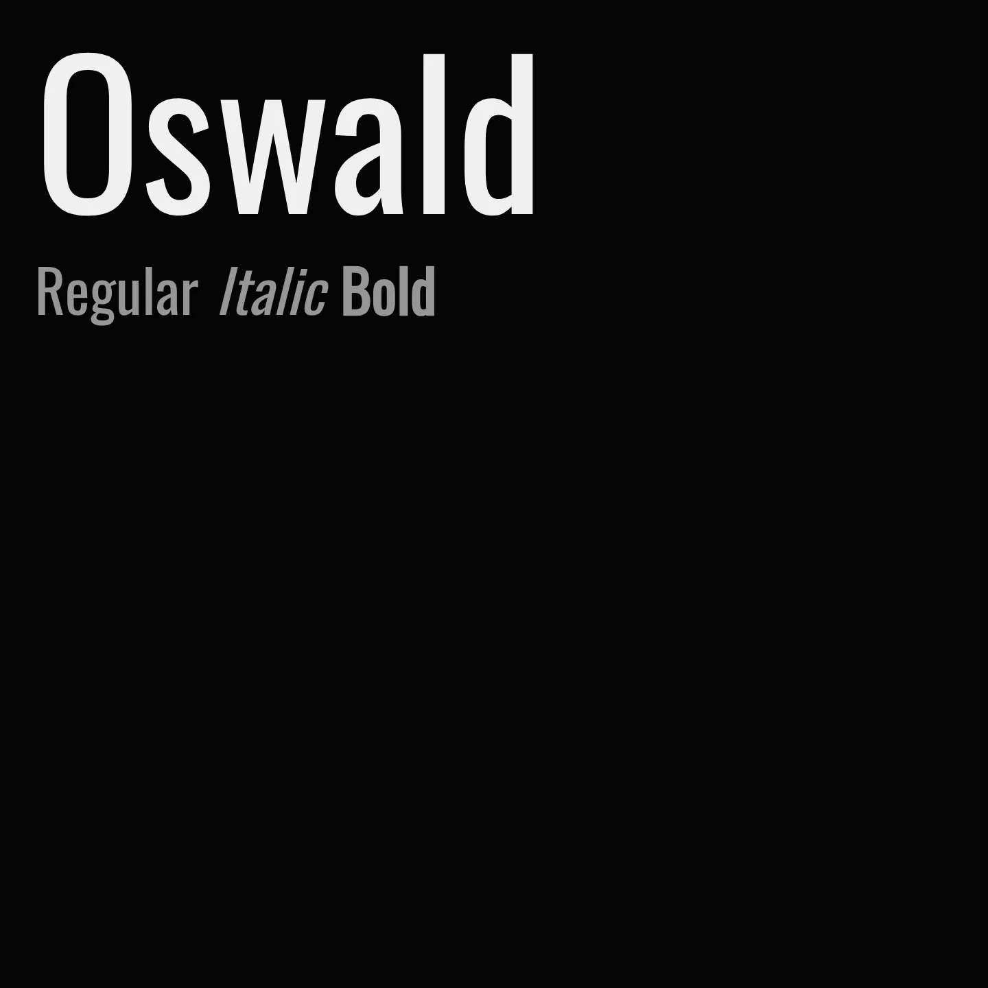
Oswald is a sans serif font family that revisits the classic Alternate Gothic style, redesigned to align well with pixel grids on digital displays. It features a variable weight axis ranging from 200 to 700 and supports multiple Latin and Cyrillic scripts. The family has been refined over time to improve spacing, kerning, and glyph design, making it suitable for web and mobile use.